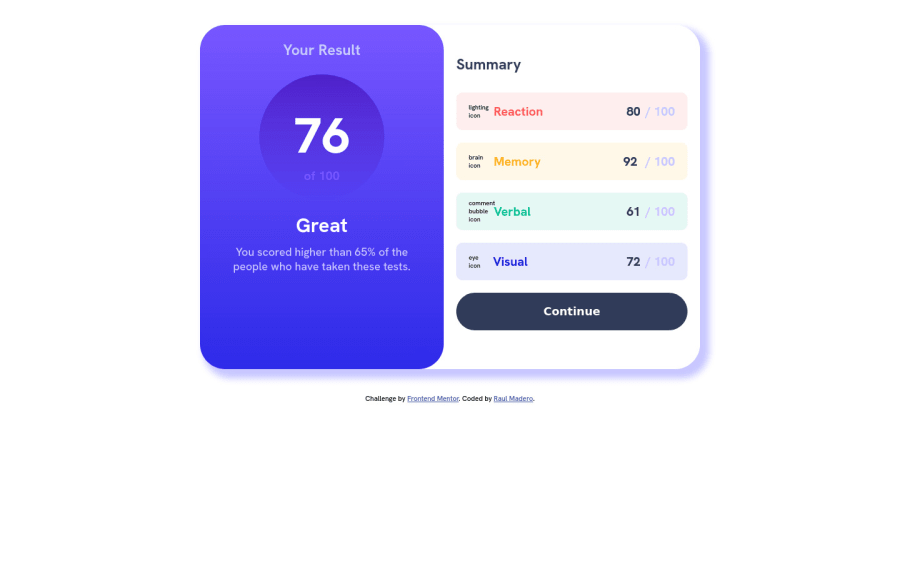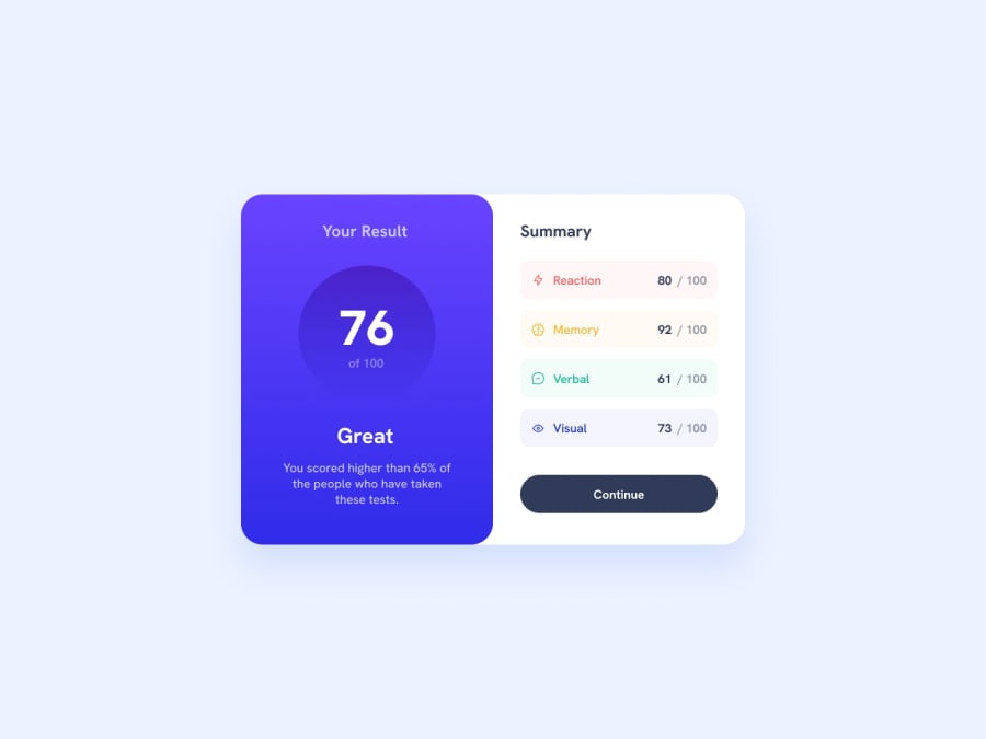
Design comparison
Solution retrospective
I think that I did it fine at this one
Community feedback
- @sumanth-chandanaPosted about 2 years ago
Hi mate!, congrats🎉 on completing the challenge. Better take care about following points.
- Always check Frontendmentor Report Generator issues after submitting the project for removing errors and warnings.
- Use the
alt(alternate text) attribute as mentioned in your Accessibility Report.altattribute is used for Screen readers applications. - Why does alt attribute matter? Read here.
- To avoid accessibility issues "All page content should be contained by landmarks" use code as :
 <body>
    <main>
        ---your code here----
    </main>
  <footer>
  </footer>
</body>
(why does
<main>matter? Read here )- For proper centering the container(whole card) vertically and horizontally you can also use the following simple block of code use code:
body{
    display: flex;
    align-items: center;
    justify-content: center;
    height: 100%;
}
or
body { min-height: 100vh; display: grid; place-content: center; }
- When we open the GitHub repository link, you will find an About Section on the right side. There, also include a live preview link of your project. It is better for someone to check your live project while interacting with code.

**I hope you will find this Feedback Helpful.**
Marked as helpful0 - @0xabdulkhaliqPosted about 2 years ago
Hello there 👋. Congratulations on successfully completing the challenge! 🎉
- I have other recommendations regarding your code that I believe will be of great interest to you.
CSS 🎨:
- Looks like the component has not been centered correctly. So let me explain, How you can easily center the component without using
marginorpadding.
- We don't need to use
marginandpaddingto center the component both horizontally & vertically. Because usingmarginorpaddingwill not dynamical centers our component at all states, Just add the following style rule
body { display: grid; place-items: center; min-height: 100vh }- Now remove these styles, after removing you can able to see the changes
main {
   margin: 4rem auto;
}
- Now your component has been properly centered
.
I hope you find this helpful 😄 Above all, the solution you submitted is great !
Happy coding!
Marked as helpful0@Raul-maderoPosted about 2 years ago@0xAbdulKhalid thanks for your feedback I tried that but it broke my code I don't really find out what its wrong, perhaps I can fixing it by adding margin-top?
0
Please log in to post a comment
Log in with GitHubJoin our Discord community
Join thousands of Frontend Mentor community members taking the challenges, sharing resources, helping each other, and chatting about all things front-end!
Join our Discord
