Submitted 5 months ago
Responsive Subscribe Component (Grid, Flexbox)
#sass/scss
@Grimm-N
Design comparison
SolutionDesign
Solution retrospective
What are you most proud of, and what would you do differently next time?
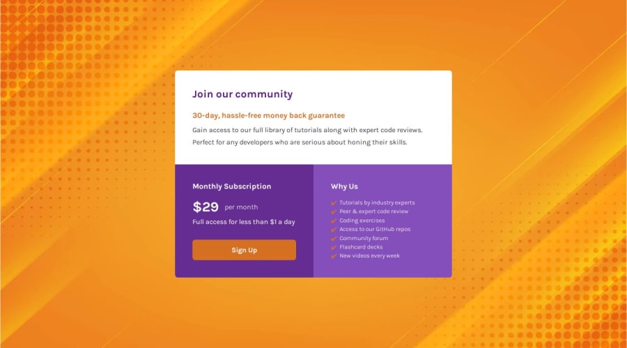
As you can see, I added markers to the "Why Us" list. The reason is simple — I kept thinking of it as regular text, but it's actually a list. So, I added markers to make the layout more visually clear.
What challenges did you encounter, and how did you overcome them?Well, I didn’t encounter any problems with this challenge. I think it’s normal, though, since it’s almost the final challenge in the Newbie category, so… 😊
What specific areas of your project would you like help with?As usual, I’m always open to any advice and comments regarding my work. It helps me grow quickly.
Community feedback
Please log in to post a comment
Log in with GitHubJoin our Discord community
Join thousands of Frontend Mentor community members taking the challenges, sharing resources, helping each other, and chatting about all things front-end!
Join our Discord
