Responsive Styling using Media Queries and Flexbox


Design comparison

Solution retrospective
I am proud that i successfully deployed my site and also wrote my first markdown file. I also improved my CSS skills. Next time I would like to push even harder and make my solution more efficient.
Community feedback
- P@kaamiikPosted about 1 month ago
Hello. Congratulations on completing this project. I think there was a misunderstanding in viewing the design images. The whole page should be light blue, and there's no need for the edges to be white. By the way, I have some notes for your code:
HTML Structure & Semantics
-
For your
h1you need something like.visually-hiddenor.sr-onlyclass. This is good for screen readers and also not show it to the users. You can search on the internet to find the styles. -
Image descriptions should be meaningful and descriptive:
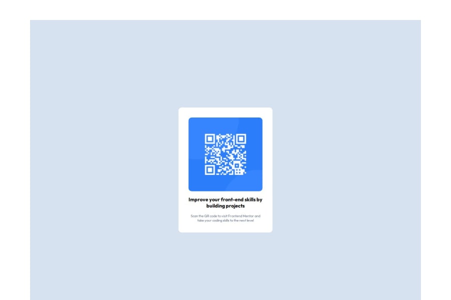
- Use alt text that explains the purpose:
alt="QR code to Frontend Mentor website" - Avoid generic descriptions like "image" or "picture"
- Use alt text that explains the purpose:
-
The bold text needs to be
h2because is a heading. -
The
.attributionneeds to be aptag because It contains a text andptag is the most proper tag here.
CSS Best Practices
-
Start with a proper CSS reset (Andy Bell or Josh Comeau recommended)
-
This ensures consistent styling across browsers
-
Avoid fixed dimensions for text containers:
Your
figurecontains text and you should not limit width and height. -
Do not use ID for css. Only use class. ID is suitable for JS and link two or more html tags together.
0 -

Please log in to post a comment
Log in with GitHub
Join our Discord community
Join thousands of Frontend Mentor community members taking the challenges, sharing resources, helping each other, and chatting about all things front-end!
Join our Discord