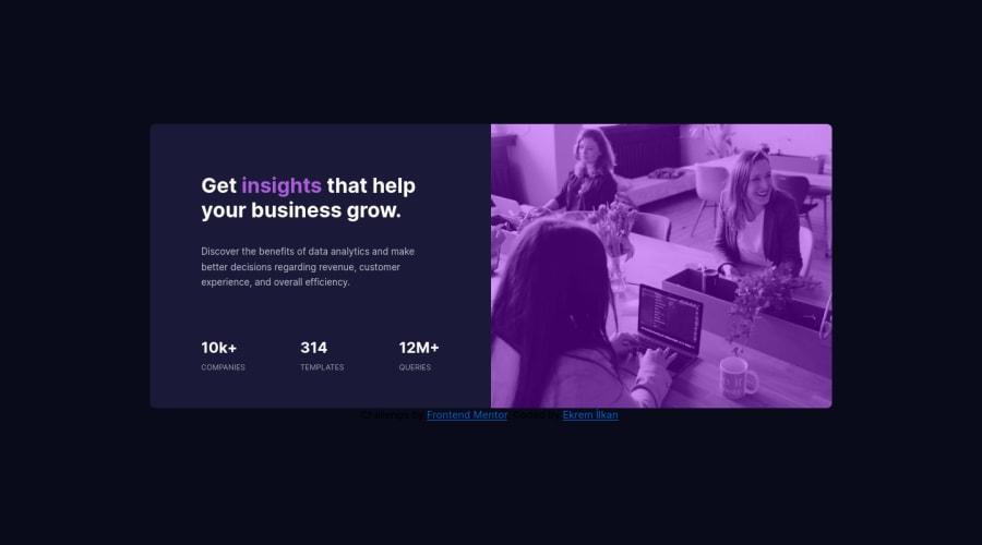
Design comparison
SolutionDesign
Solution retrospective
Hello everybody. Here is my solution for the challenge but i got some issues when i want to add filter to the photo. Stock design looks a bit darker than my solution. I still have a lot of things to learn about responsive web design. I'm open for suggestions. Thank y'all :)
Community feedback
- @ChristBMPosted almost 3 years ago
Hi, great job EKREM, This topic can be interesting to you: CSS backdrop-filter
/* <filter-function> values */
backdrop-filter: blur(2px);
backdrop-filter: brightness(60%);
backdrop-filter: contrast(40%);
backdrop-filter: drop-shadow(4px 4px 10px blue);
backdrop-filter: grayscale(30%);
backdrop-filter: hue-rotate(120deg);
backdrop-filter: invert(70%);
backdrop-filter: opacity(20%);
backdrop-filter: sepia(90%);
backdrop-filter: saturate(80%);
Marked as helpful0@ekremilkanPosted almost 3 years ago@ChristBM Thank you so much Christian :) this topic helped me a lot.
0
Please log in to post a comment
Log in with GitHubJoin our Discord community
Join thousands of Frontend Mentor community members taking the challenges, sharing resources, helping each other, and chatting about all things front-end!
Join our Discord
