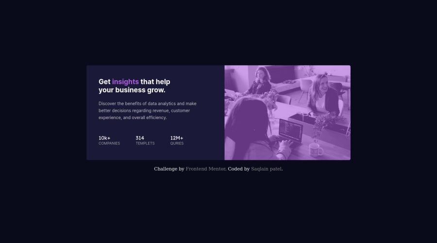
Design comparison
SolutionDesign
Solution retrospective
Hi!✋ This Is The Second Challenge I have Used Flexbox. I Hope You Guys Like It. Any Advice, Suggestion To Improve Would Be Much Appreciated. Thankyouu....🤗
Community feedback
- @Juveria-DalviPosted about 3 years ago
I think you should remove this from mobile preview
.card__container {margin-top: 50px;}Also check this you closed something after footer that is giving accessibility issue
        <div class="attribution">
            Challenge by <a href="https://www.frontendmentor.io?ref=challenge" target="_blank">Frontend Mentor</a>.
            Coded by <a href="#">Saqlain patel</a>.
          </div>
        </footer>
    </div>
  </body>```
1
Please log in to post a comment
Log in with GitHubJoin our Discord community
Join thousands of Frontend Mentor community members taking the challenges, sharing resources, helping each other, and chatting about all things front-end!
Join our Discord
