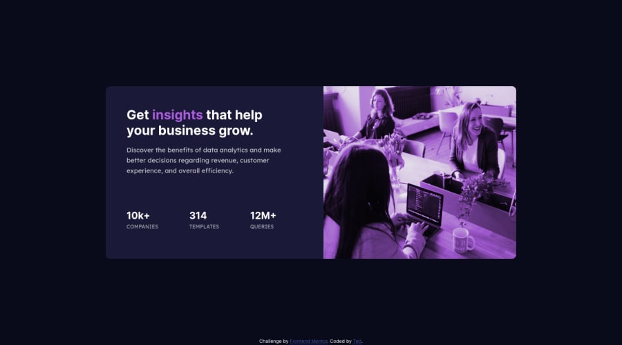
Design comparison
Solution retrospective
It was a bit tough in terms of responsiveness and overlay color, that is my best overlay color could not achieve it more 😄, If there are some issues to improve, I will be glad to hear from you guys and not repeat them in the future 😉.
Community feedback
- @paiputPosted about 3 years ago
Hi Ted! Nice job with this challange!
I just have one suggestion, and it's that to make the overlay color look a bit more like in the design by changing the
.bg-imgbackground-blend-modeproperty tomultiply. It won't look 100% the same as the design but I think it's pretty close.Hope that helps.
0@sharipoff-0-1Posted about 3 years ago@paiput Hi! thank you, yeah I tried that property, it did look different, so I ended up with my own preferred design. :)
1
Please log in to post a comment
Log in with GitHubJoin our Discord community
Join thousands of Frontend Mentor community members taking the challenges, sharing resources, helping each other, and chatting about all things front-end!
Join our Discord
