Design comparison
Solution retrospective
Feedback is greatly appreciated! ✨
Please log in to post a comment
Log in with GitHubCommunity feedback
- @ChamuMutezva
Greetings Estèlle. So far so good with the project and one more push will make it awesome. Here are a few things that you can have a look at:
- on mobile - the attribution class is positioned on top of other elements. I would suggest some changes in the styling you have done. For example the card has
display: flex, but the children at the same time are usingfloat: rightandfloat: left. This layout can be achieved by flex and there is really no need to use floats(which is rarely used these days). - try using classes instead of id's
- the heading h2 in the info class with text value of numbers eg 10k+ does not help assistive technology users on what the heading is for and what to expect.
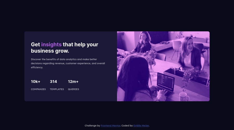
- the presentation on desktop is much better as there is no text positioned on top of others. Well done
- on mobile - the attribution class is positioned on top of other elements. I would suggest some changes in the styling you have done. For example the card has
- @Muhammad-samir
Good job every thing perfect but I think you should add margin left to each elements to be centered and I think you have to change the color of the image Good luck
- @khalafalla
Pretty good, but using sass and pugJs will help u soo much
Join our Discord community
Join thousands of Frontend Mentor community members taking the challenges, sharing resources, helping each other, and chatting about all things front-end!
Join our Discord
