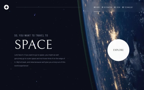
Design comparison
Solution retrospective
i had some problems of centering images and text in mobile and tablets design, but i found a solution, but can anyone please suggest any other ways. pls is there a more efficient way of dealing with media queries . thanks
Community feedback
- @RaidEyesPosted about 1 year ago
Nice animation you got there, really inspiring! However, I think I found a bug!
In your destination section, the page seems to stretch, notice the scroll bar when you open this page. And because of that, there's a small extra space at the bottom of the section. So far, I haven't found the reason why but you can check and fix it!
Overall, good work! Happy coding!
Marked as helpful1@ZHADOW999Posted about 1 year ago@RaidEyes thank you , I noticed that too and I will look into it 😁
0 - @CarlHummPosted about 1 year ago
Hi Zhadow, really cool project
I like the animations you've included like the rotating planets and subtle fade/slide ins.
I did notice you have one broken link between your
crew.html
andindex.html
as you have mistypedspace.html
in-place ofindex.html
.Additionally, setting height for an image is generally discouraged as it distorts and stretches the images aspect-ratio. To maintain aspect ratio and set a specific height you can use
object-fit: cover
property which works similiar tobackground-size: cover
in that it crops the image instead of distorting it.Other than this, great job and keep up the good work!
Marked as helpful0@ZHADOW999Posted about 1 year ago@CarlHumm thank you so much 👍🙏😁your feedback is appreciated
1
Please log in to post a comment
Log in with GitHubJoin our Discord community
Join thousands of Frontend Mentor community members taking the challenges, sharing resources, helping each other, and chatting about all things front-end!
Join our Discord