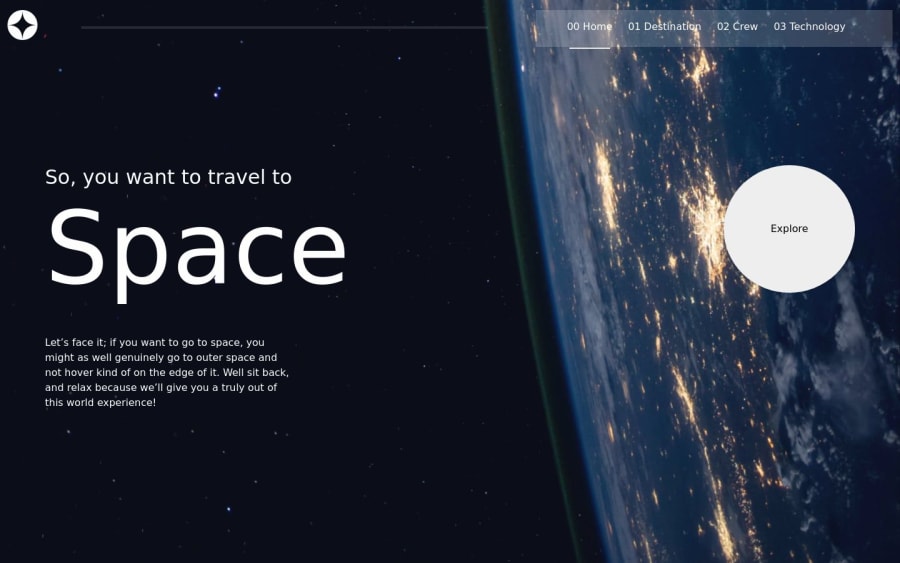
responsive space tourism website with onload animations🤩
Design comparison
Solution retrospective
I just wrapped up the space tourism website challenge and am over the moon with how it turned out! 🚀🌙 It was a total blast getting to build a responsive site that allowed users to explore some out of this world destinations, crew members, and technology!
I focused on using plain ol' HTML, CSS and vanilla JS to bring it to life. Some of the fun interactions I built include:
Tabbed navigation to toggle between different options 👽 Smooth scrolling between page sections 🚀 Groovy page load animations with animxyz 🌀 In terms of accessibility though, I know there's room for improvement:
Add more descriptive alt text for images 📷 Structure markup more semantically with tags like <header> 🏛️ Improve color contrast in places ☑️ Do more testing with assistive tech like screen readers 🎧 Overall, I'm super proud of what I built! 💪 But I'm also excited to keep improving, especially on web accessibility best practices. Let me know if you have any other specific feedback based on the code provided!
Community feedback
Please log in to post a comment
Log in with GitHubJoin our Discord community
Join thousands of Frontend Mentor community members taking the challenges, sharing resources, helping each other, and chatting about all things front-end!
Join our Discord
