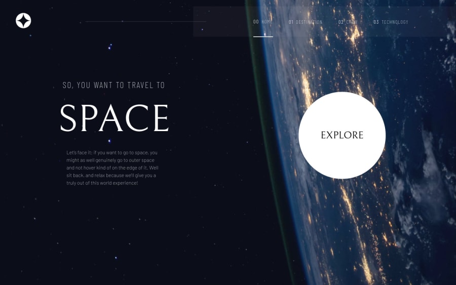
Design comparison
SolutionDesign
Solution retrospective
Please checkout the website and give feedback.
Community feedback
- @denieldenPosted over 2 years ago
Hi Vijaya, great work on this challenge! 😉
Here are a few tips for improve your code:
- the link at google font go inside the
headof document not insidebody - add
headertag and wrap thenavfor improve the Accessibility - use
maintag to wrap the content of page for improve the Accessibility - using
<hr>for the line is not the best way because this tag have a semantic meaning... in this case useborderproperty because this line is decorative - use
h1 and h2tag for the titles and not adiv - add
transitionon the element with hover effect - in the mobile the menu is illegible because firefox doesn’t support the css
backdrop-filterproperty, you can add an exception in firefox by putting a solid color there only through@supports, look here: backdrop-filter and @supports
Overall you did well 😁 Hope this help!
Marked as helpful1 - the link at google font go inside the
Please log in to post a comment
Log in with GitHubJoin our Discord community
Join thousands of Frontend Mentor community members taking the challenges, sharing resources, helping each other, and chatting about all things front-end!
Join our Discord
