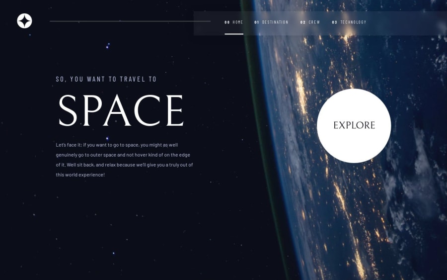
Responsive Space Page Created With React
Design comparison
Solution retrospective
I am proud of how clean and smooth the animations and information look, I really like this layout and use of images the design really brings the whole website together.
What challenges did you encounter, and how did you overcome them?Some of my layouts do not follow the Figma file, due to contradicting code that will later on in the future make it a bit more difficult to update. I tweaked a couple of things here and there in order for the website to be fully responsive across all Devices. My next goal is to keep some of the Figma files design as organic as possible while being fully responsive.
What specific areas of your project would you like help with?I would like to get a bit more help with wrappers and container as I fell this could boost my responsive layout skills a lot more.
Community feedback
Please log in to post a comment
Log in with GitHubJoin our Discord community
Join thousands of Frontend Mentor community members taking the challenges, sharing resources, helping each other, and chatting about all things front-end!
Join our Discord
