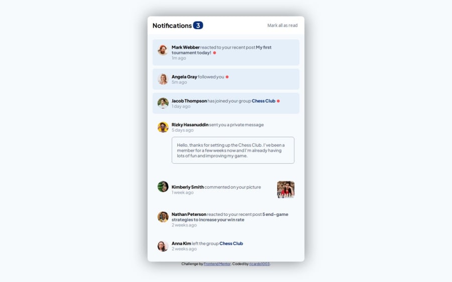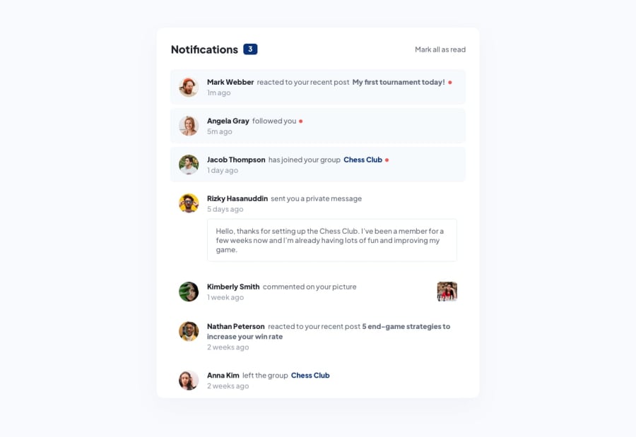
Design comparison
Solution retrospective
I wouldn't do anything different next time, I think that everything here is according to the design. But it is not 100% accurate since i don't have the Figma design, but if I had it, i would try to make it as accurate as possible.
What challenges did you encounter, and how did you overcome them?I didn't encounter any major challenge, the only thing that I had to figure out was to make the number of notifications change depending of how many of them are unread. But this was not hard, I only had to use array.filter() and since i haven't used it before it took some minutes to understand it well and use it properly.
What specific areas of your project would you like help with?For now I don't think that I need help with anything regarding to this project, since everything was easy and I consider that it was all right, but if anyone considers that something is wrong, I would like to hear what they think so I can improve and do it differently next time.
Community feedback
Please log in to post a comment
Log in with GitHubJoin our Discord community
Join thousands of Frontend Mentor community members taking the challenges, sharing resources, helping each other, and chatting about all things front-end!
Join our Discord
