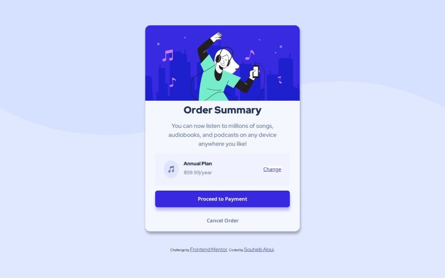
Design comparison
SolutionDesign
Solution retrospective
What are you most proud of, and what would you do differently next time?
Making the layout was easier than usual ( i believe that's a good sign ) even though it's a simple card.
What challenges did you encounter, and how did you overcome them?- The background-image was challenging. How to position it properly.
Any suggestions would be helpful :)
Community feedback
Please log in to post a comment
Log in with GitHubJoin our Discord community
Join thousands of Frontend Mentor community members taking the challenges, sharing resources, helping each other, and chatting about all things front-end!
Join our Discord
