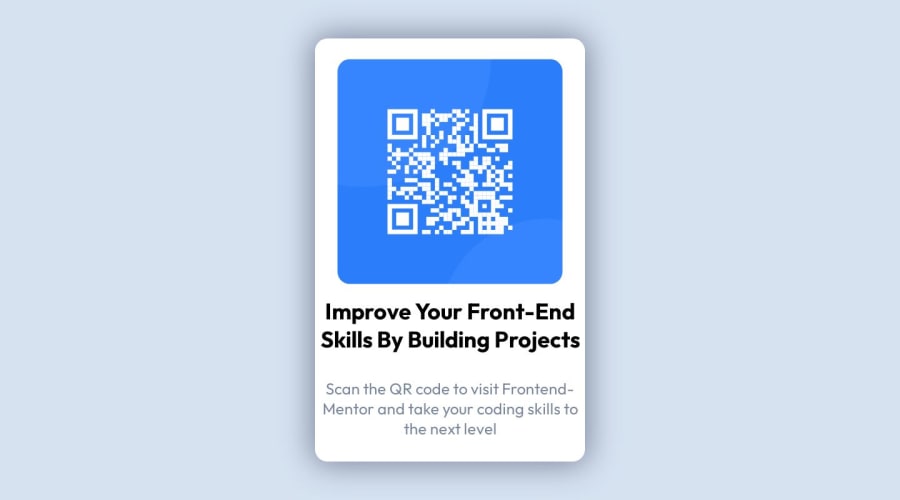
Design comparison
Solution retrospective
-Are there any redundant lines of code that can be eliminated?
-Is my code organized / easy to read?
-What could I have written better?
Community feedback
- P@danielmrz-devPosted over 1 year ago
Hello @ljaksen!
Your solution looks great!
I have a suggestion for improvement:
- For semantic reasons, use
mainto wrap the main content instead of adiv.
📌 This tag change does not impact your project visually and makes your HTML code more semantic, improving SEO optimization as well as the accessibility of your project.
I hope it helps!
Other than that, great job!
Marked as helpful0 - For semantic reasons, use
- @bbsmoothdevPosted over 1 year ago
Hey, great start on this. I'd like you to do a little experiment with me. While viewing your page, set the width of your browser to as close to
1280pxas you can get. Then, use the browser zoom feature to zoom into the page400%. Notice that as you zoom in, the size of the text doesn't change. This is actually a major accessibility issue. To be accessible, people should be able to increase the text size by at least200%. The way you've set up the font size is preventing people from doing that. So you'll want to let the font size grow, and the size of the card to grow to accommodate the increase in font size. To do this, I would highly recommend you not usevwunits for either font size or any widths.Marked as helpful0@ljaksenPosted over 1 year ago@bbsmoothdev
Hello! thanks for the feedback and input, had you not pointed that out I probably would would've kept doing that so I appreciate it greatly! I do have two questions though. When I use the zoom feature on my browser (firefox) the font size does grow, just so that I see what you see how might I replicate that? I figured using the clamp() function and setting the font size to REM with VW in the middle would get around any problems. My other question is what would be best practice? using a calc() function or continue with clamp() but have no VW inside. Thank you!
0@bbsmoothdevPosted over 1 year ago@ljaksen You might have Firefox set to zoom text only. In that case the text will get bigger. But Firefox is the only browser that has zoom text only. If you zoom with Chrome you will see the issue.
0
Please log in to post a comment
Log in with GitHubJoin our Discord community
Join thousands of Frontend Mentor community members taking the challenges, sharing resources, helping each other, and chatting about all things front-end!
Join our Discord
