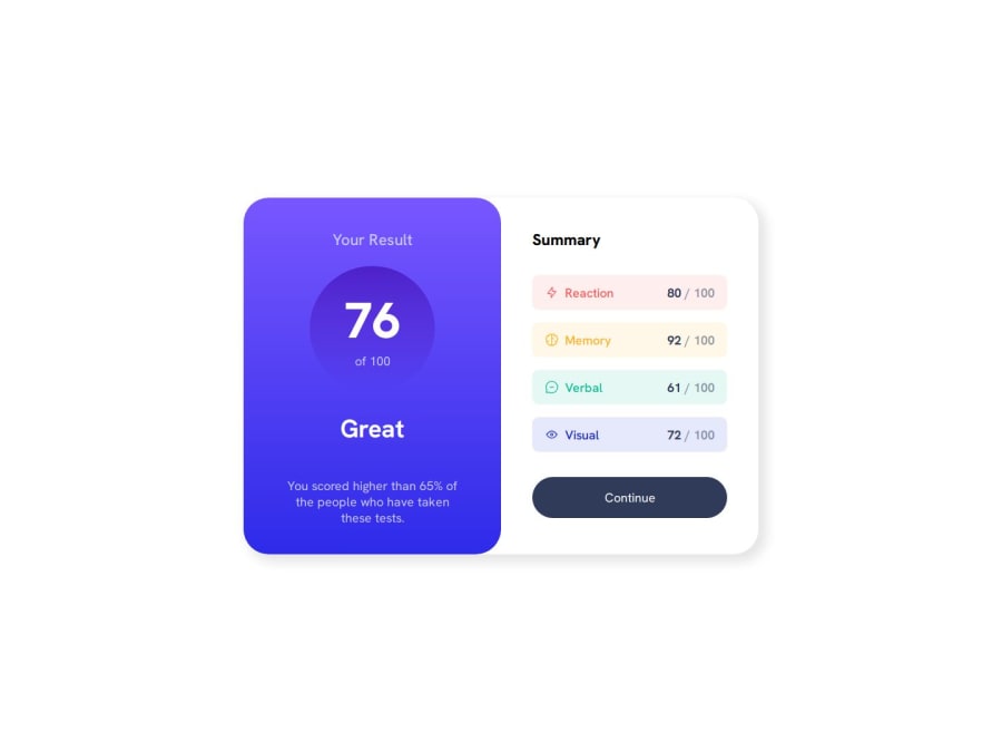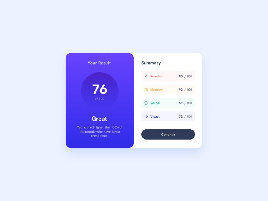
Design comparison
SolutionDesign
Solution retrospective
What are you most proud of, and what would you do differently next time?
I was able to develop a responsive solution using only the minmax property of the css grid.
What specific areas of your project would you like help with?As I said earlier, I've managed to solve the card's responsiveness with just the grid, but I'd like to see ways of getting rid of the other media-queries that are left over. I don't think they're a problem, but if I could write a code without them, I think it would make the code cleaner and more efficient.
Community feedback
Please log in to post a comment
Log in with GitHubJoin our Discord community
Join thousands of Frontend Mentor community members taking the challenges, sharing resources, helping each other, and chatting about all things front-end!
Join our Discord
