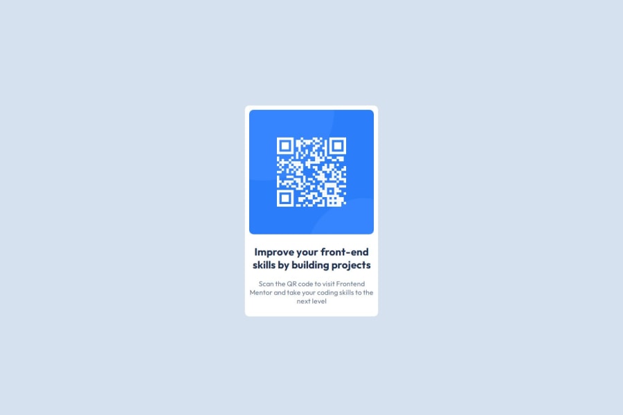
Design comparison
SolutionDesign
Solution retrospective
What are you most proud of, and what would you do differently next time?
It actually looks like the design!
Next time I would try to make better use of figma
What challenges did you encounter, and how did you overcome them?- I need to brush up on semantic HTML as I'm not sure if section was the correct tag to use.
- More practice with flexbox needed, I spent too long on it. I overcame this by watching videos and going over Flexbox Froggy
- A better understanding of how to accommodate different screen sizes with media queries is required. Again, I watched videos but I didn't see much about the actual screen sizes
- Figma was hard to use/figure out. I mostly battled through without it
Perhaps some good resources on the areas mentioned above?
Community feedback
Please log in to post a comment
Log in with GitHubJoin our Discord community
Join thousands of Frontend Mentor community members taking the challenges, sharing resources, helping each other, and chatting about all things front-end!
Join our Discord
