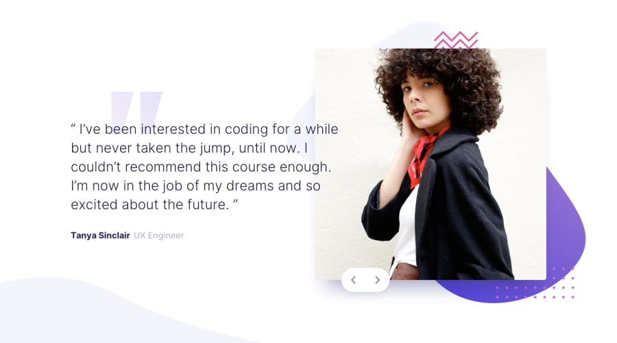
Responsive solution using CSS Bootstrap and jQuery Javascript Library
Design comparison
Solution retrospective
It's been a while since I've practiced Frontend Development. In this project I really struggled with positioning elements i.e. image, background image and buttons, I did my best to adjust them as accurately as I could, but as always if you could suggest any improvement especially for positioning elements that'd be great!
Community feedback
- @mattstuddertPosted over 4 years ago
Nice work on this challenge! You've done a good job of reproducing the design. I've got a couple of small suggestions but nothing major. Here they are:
- Change the
height: 100%on.container-fluidtomin-height: 100%. This will let the element grow when the content grows taller than the height of the viewport on mobile. You'll see that the background curve pattern in the bottom left doesn't stick to the bottom of the screen on mobile. This will fix that 👍 - I like the way you've experimented with content transitions when the slides change. I'd recommend adding a hover state and
cursor: pointer;to the buttons to indicate that they're interactive elements. - You could smooth out the responsiveness slightly. You'll notice the text overlaps the image and becomes unreadable at around a small tablet size.
You've done a really good job though. Keep up the great work! 🙌
1@XaFaK-01Posted over 4 years ago@mattstuddert Thanks allot for such a detailed guide line, I will apply the changes as you stated...
0 - Change the
- @jomefavouritePosted over 4 years ago
Super dope
1 - @edavid78Posted over 4 years ago
Looks good!
1
Please log in to post a comment
Log in with GitHubJoin our Discord community
Join thousands of Frontend Mentor community members taking the challenges, sharing resources, helping each other, and chatting about all things front-end!
Join our Discord
