Design comparison
SolutionDesign
Solution retrospective
What are you most proud of, and what would you do differently next time?
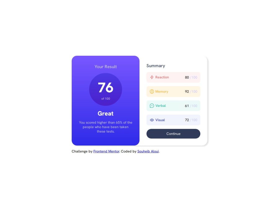
- Proud of how a single change in the media query replicates the mobile design with fewer lines of code.
- The background color as a linear gradient was tough , didn't know the proper syntax to use it with variables.
- Making the circle was a challenge , thought maybe using two "p" was causing the issue as block element so i switched to a div with two spans (inline elements) .
-
Once again the colors , can't tell which is which for example the lavender and white as a background for right side of container.
-
Wondering if i have written unnecessary properties and values in css.
-
I can see a box-shadow on the card/container but is it only visible on the right side or am i mistaken .
Any feedback and or criticism would be appreciated .
Community feedback
Please log in to post a comment
Log in with GitHubJoin our Discord community
Join thousands of Frontend Mentor community members taking the challenges, sharing resources, helping each other, and chatting about all things front-end!
Join our Discord
