Not Found
Not Found
Not Found
Not Found
Not Found
Not Found
Not Found
Not Found
Not Found
Not Found
Not Found
Not Found
Not Found
Not Found
Not Found
Not Found
Not Found
Not Found
Not Found
Not Found

Submitted

Responsive solution to: Product preview card component challenge
P
josip-hā€¢ 90

@josip-h

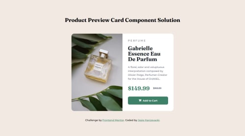
Desktop design screenshot for the Product preview card component coding challenge

This is a solution for...

  • HTML
  • CSS
1newbie
View challenge

Design comparison


SolutionDesign

Solution retrospective


What are you most proud of, and what would you do differently next time?

I am most proud of making my solution responsive by using relative units, which allow the content to scale proportionally with changes in the root element's font size.

What challenges did you encounter, and how did you overcome them?

I encountered two problems while solving this challenge:

  1. Figuring out how to use em and rem units to ensure that the content scales with changes in the root element's font size. This problem was resolved by watching Kevin Powell's video on this topic, as well as through trial and error.

  2. Deciding on the best approach for using a media query to make the page responsive while keeping the code as concise as possible. While I am certain that there might be room for improvement, this represents the best solution I can achieve at the moment.

What specific areas of your project would you like help with?

Any feedback on my approach to solving the two problems mentioned above would be greatly appreciated. Additionally, I welcome any other comments or critiques.

Community feedback

Daniel šŸ›øā€¢ 44,230

@danielmrz-dev

Posted

Hey there! šŸ™‹šŸ½ā€ā™‚ļø

Congrats on finishing the challenge! āœ…

Your project looks awesome!

Here's a tip that might interest you:

šŸ“Œ When you have different versions of the same image, consider using the <picture> tag.

This will help ensure the correct image loads on the user's device, saving bandwidth and boosting performance.

Example:

<picture>
    <source media="(min-width: 768px)" srcset="{desktop image path here}">
    <img src="{mobile image path here}" alt="{alternative text here}">
</picture>

Hope you find this useful!

Great job overall!

Marked as helpful

0

P
josip-hā€¢ 90

@josip-h

Posted

Hi Daniel,

Thank you for your suggestion and clear explanation. I wasn't familiar with the <picture> element until you mentioned it. I have now implemented it in the solution. Thanks for making it better!

Also, your comment's markup, structure, and approach are excellent. I'm sure I'll learn something from that too!

1
Daniel šŸ›øā€¢ 44,230

@danielmrz-dev

Posted

@josip-h I'm glad my comment was helpful! šŸ˜Šāœ…

0

Please log in to post a comment

Log in with GitHub
Discord logo

Join our Discord community

Join thousands of Frontend Mentor community members taking the challenges, sharing resources, helping each other, and chatting about all things front-end!

Join our Discord