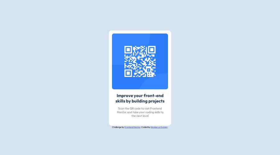
Design comparison
SolutionDesign
Solution retrospective
What are you most proud of, and what would you do differently next time?
I'm proud to use figma for this tiny project, it's the first time i use it.
What challenges did you encounter, and how did you overcome them?I tried to do the exact same page then the figma file, but there still have tiny difference.
What specific areas of your project would you like help with?I just want to know what i did wrong and what i can improve ?
Community feedback
Please log in to post a comment
Log in with GitHubJoin our Discord community
Join thousands of Frontend Mentor community members taking the challenges, sharing resources, helping each other, and chatting about all things front-end!
Join our Discord
