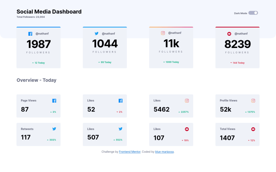
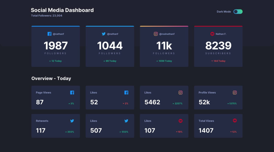
Responsive social-media-dashboard built with HTML5, CSS3 & JS


Design comparison
Solution retrospective
Hey there! Thanks for your suggestions and feedback - appreciate them all. All these challenges and suggestions have got me researching, learnig new things/concepts and broadening my understading of things i already know; atleast i thought i knew. Continue being great..
Community feedback
- @Daniel3-14Posted about 2 years ago
Hi! I think this looks good!
I might just be being overly picky, but I feel like the gap in between the boxes should be static, and not be growing with the screen size. It is a little off-putting, and in this particular circumstance, it starts to look like 4 distinct columns that you might assume have related data, but they don't.
(i.e. The two smaller boxes under the big Facebook box have information for Facebook and Twitter)
Adding a static sized gap between the cards, maybe increasing the card max-width (or perhaps not having one at all?) and maybe decreasing the 'main' max-width just a bit are my suggestions.
Good job! Hope this helps!
Marked as helpful1

Please log in to post a comment
Log in with GitHub
Join our Discord community
Join thousands of Frontend Mentor community members taking the challenges, sharing resources, helping each other, and chatting about all things front-end!
Join our Discord