Design comparison
SolutionDesign
Community feedback
- @BlackpachamamePosted 10 months ago
Greetings! you have done a great job 😎
📌 Some accessibility and semantics recommendations for your HTML
- To improve the semantics of your HTML, you can change your
<div class="container">to a<main class="container">and the<div class="attribution">to a<footer class="attribution">. Thedivthat contains both should be removed, it has no use - I recommend doing a small
resetto the styles that come by default in the browsers. To do this, you can apply a couple of properties to the universal selector*, with this you will make your site look the same in all browsers - I leave you the task of researching the
reset CSSand thebox-sizing: border-box - If you didn't apply the reset, you can add
margin: 0to yourbody, this will remove annoying scrolling on large screens. If you want to maintain separation on very small screens, you can apply themarginagain using media querys - Instead of using
marginto center your content in the center of the screen, you can use theflexboxproperties in thebody:
body { display: flex; flex-direction: column; justify-content: center; align-items: center; gap: 20px; /* Separate the main from the footer */ background-color: rgb(29, 27, 27); min-height: 100vh; margin: 0; }- For the images to be seen correctly in github pages, you must add a
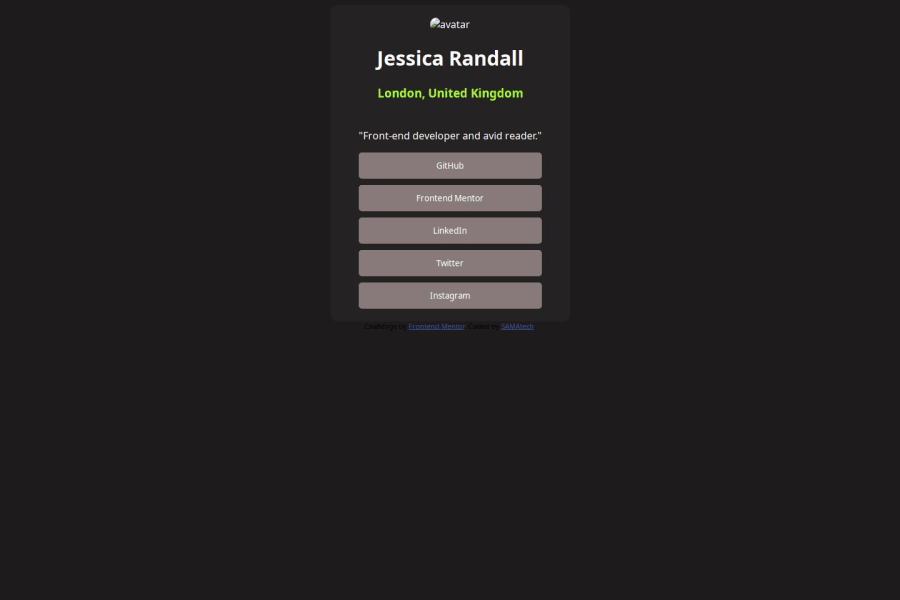
.to the beginning of the path. For example, the correct form for the avatar image would be:src="./image/avatar-jessica.jpeg"
Marked as helpful0 - To improve the semantics of your HTML, you can change your
Please log in to post a comment
Log in with GitHubJoin our Discord community
Join thousands of Frontend Mentor community members taking the challenges, sharing resources, helping each other, and chatting about all things front-end!
Join our Discord
