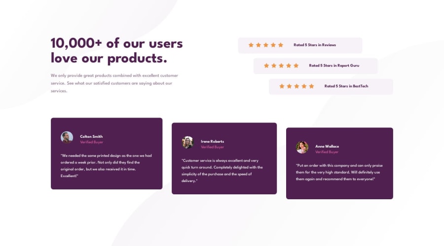
Responsive social section using CSS variables, media queries & flexbox
Design comparison
Solution retrospective
I saw some tutorials and I did not know a lot of things. Such as the CSS variables make everything so easy. I only now know how to make them.
I have problems with the responsiveness and the idea of mobile first is very interesting. I hope to have some time to work on other projects.
I'm learning by myself and always wonder what the best practices are.
Community feedback
- @HusseinSamyPosted 11 months ago
Hello @archeana, 👋🏻
Awesome job on taking the first steps towards your dream!
I'm thrilled to see your engagement with this platform to enhance your design skills. However, I have some quick suggestions for you:
1.Regarding commit messages, you can use some conventions, it will help you a lot in your future career when working in teams.
2.You can put all your project assets (icons, images, etc..) in a folder and call it "assets" for better code structure.
Hope you find it useful!😇
Keep up the fantastic work, and happy coding! 🚀
Marked as helpful0@archeanaPosted 11 months agoHey @HusseinSamy,
Thanks for your feedback.
I like the idea of assets! I will check the link for the conventions!
1 - @kimodev1990Posted 11 months ago
- You could use clamp ( ) method in your coding for font-size, width, paddings, margins, etc., So the designed sizes will change according to the viewport dimensions having a responsive design and will be suitable for any device layout.
Hope you find this Useful & Helpful.
Other than that, Really Nice work & keep Going on !!
0
Please log in to post a comment
Log in with GitHubJoin our Discord community
Join thousands of Frontend Mentor community members taking the challenges, sharing resources, helping each other, and chatting about all things front-end!
Join our Discord
