Design comparison
SolutionDesign
Solution retrospective
Hi Frontend Mentor community 👋
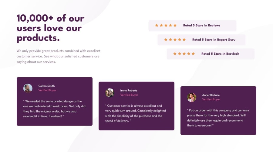
This is my solution on the social proof section challenge. Quite a fun challenge, took a lot of testing and small adjustments, this made the css code a litte bigger than the usual, specially the media query part. Is there a better way to do the media queries in my case?
Thanks in advance for the feedback and the tips!😄
Community feedback
Please log in to post a comment
Log in with GitHubJoin our Discord community
Join thousands of Frontend Mentor community members taking the challenges, sharing resources, helping each other, and chatting about all things front-end!
Join our Discord
