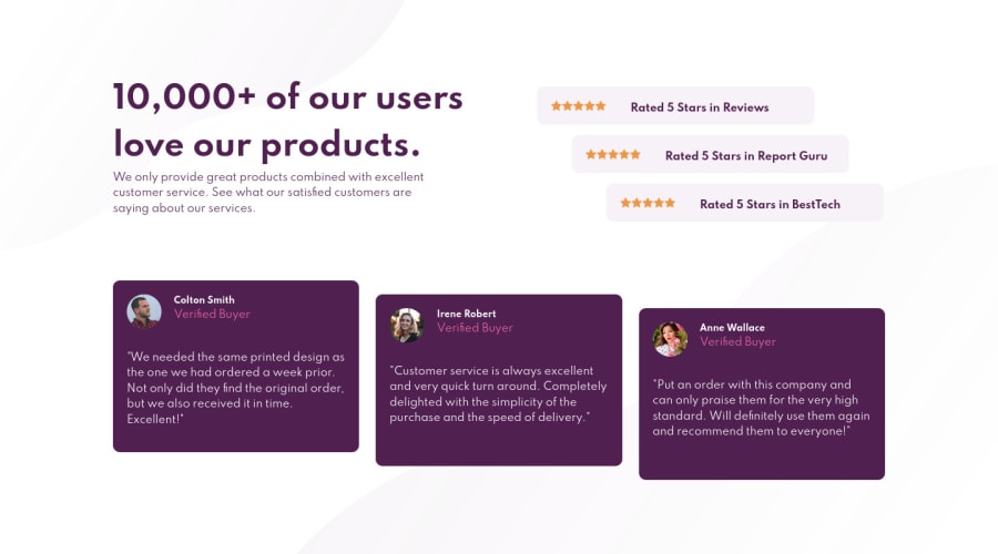
Responsive Social Proof Section using HTML, CSS Flexbox and Grid
Design comparison
Solution retrospective
I have to admit that this was quite challenging and frustrating at first, which was disheartening because I thought that I was already well-versed and equipped when I began this challenge, unfortunately, I was wrong. I got so frustrated I had to step out for a few times and challenge myself to think more calmly.
What helped me finally complete this challenged was to dissect each part of the challenge starting from the biggest to the smallest, how their characteristics, and what does translate to in terms of CSS. It feels good to have finally finish this, but I know that there are things I could improve on. I would love to hear your feedback.
I used one media query for now, I'm still new to using media queries, hopefully, I'll get more used to it in the next challenges.
Community feedback
- @wahyufaturrizkyPosted about 3 years ago
Great work @ellenearteleg,
Maybe some advice for increasing your accessibility web by reading this article https://medium.com/swlh/all-we-need-to-know-about-web-accessibility-8d0957208f
don't forget to hit the button "remark helpful" cheers :)
0
Please log in to post a comment
Log in with GitHubJoin our Discord community
Join thousands of Frontend Mentor community members taking the challenges, sharing resources, helping each other, and chatting about all things front-end!
Join our Discord

