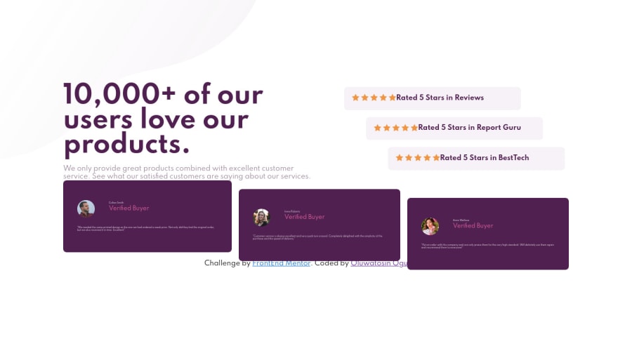
Responsive social proof section using HTML, CSS FELXBOX, and CSS GRID
Design comparison
Solution retrospective
Community, I need your help.
What I found difficult while building the project? I found it difficult to implement background images for each device(responsiveness). How do I put two images and background. Also, the favicon imahe, where am I to put it?
Which areas of my code am I unsure of? I am not so sure about the margins and padding.
Questions about best practices? While etsting the HTML markup, it mentioned something about a missing heading in the second section. Kindly look through and tell me what else I am missing.
Thank you.
Community feedback
- @JorahhhPosted over 2 years ago
Hey Abigail, to put two images in the backgroud, try with this:
Background-image: url(“top bg), url(“bottom bg”); Background- repeat: no repeat, no repeat; Background-position: left top, right bottom; Background-size: contain;
I did like this in my project, so I think it works 👌🏽
…and oh, good job!
Marked as helpful0@Heph-zibahPosted over 2 years ago@Jorahhh Wow!
I'll definitely try this. You just made it all easy.
Thank you.
1 - @shashreesamuelPosted over 2 years ago
Hey Heph-zibah, good job completing this challenge. Keep up the good work
Your solution looks great however I think your card needs some margin from the top using
margin-toppropertyIn terms of your accessibility issue simply wrap all your content between
<main>tags.The favicon image is already presetted in the starter file to display in the browser tab so no need to worry about implementing it
I hope this helps
Cheers Happy coding 👍
Marked as helpful0@Heph-zibahPosted over 2 years ago@TheCoderGuru Margin-top it is then.
Alright. Thank you for the feedback. I do appreciate it.
0
Please log in to post a comment
Log in with GitHubJoin our Discord community
Join thousands of Frontend Mentor community members taking the challenges, sharing resources, helping each other, and chatting about all things front-end!
Join our Discord
