Submitted almost 3 years ago
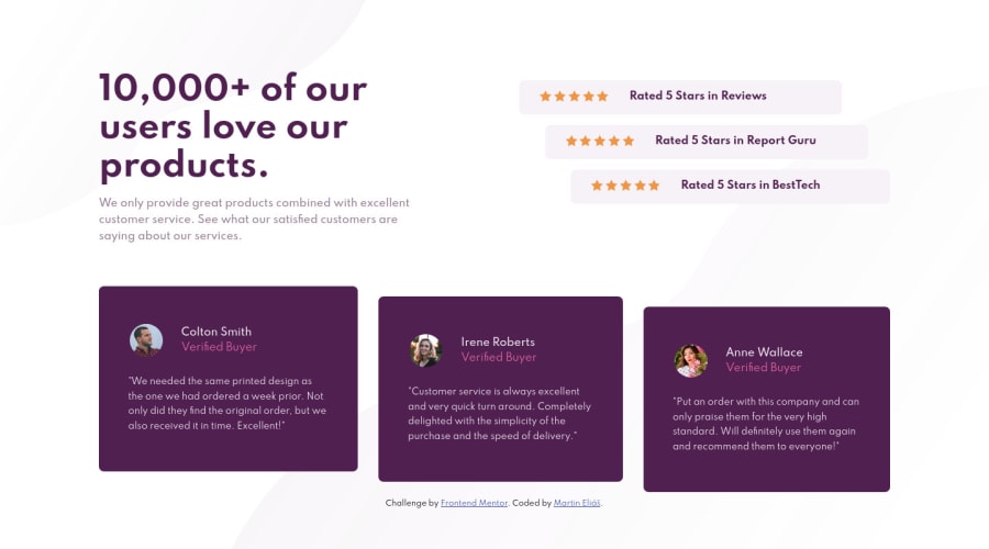
Responsive social proof section using Flexbox, media queries
@martinelias1312
Design comparison
SolutionDesign
Solution retrospective
Any recommendations apprecieted !
Community feedback
- @pikapikamartPosted almost 3 years ago
Hey, really nice work on this one. Desktop layout looks great, the site is responsive and the mobile state looks great as well. Neat!
Some suggestions on the site would be:
- For this one, you should have used the
mainto wrap all the main-content of the site since this is the whole main-content.footeris not needed in here as well so you can remove those but leave thefooterfor the.attributionand use this markup:
<main /> <footer /> # must be outside the main, attribution in here- If you zoom out from the layout, you will notice that the content are being stretched, to prevent this, use a
max-widthon thebodytag so that the layout will prevent the content from being stretched for wide screen. articleandasideis not needed in here as well. You usearticlewhen you want something, a component to be redistributable for other parts of the site since it is independent content.asideon the other hand, I don't have much experience aboutasideto be honest, but I think replacing it with justdivwould be fine:>>- Those star-icons are only decorative. Decorative images should be hidden for screen-reader at all times by using
alt=""andaria-hidden="true"to theimgtag or onlyaria-hidden="true"if you are usingsvginstead ofimgtag. - Only use descriptive
alton images that are meaningful and adds content to the site otherwise hide the image for screen-reader users. - Also, another approach for those stars would be using them as value for the
backgroundproperty for each.starsselector. Thebackgroundproperty can accept images as many as you want, have a search aboutbackground. - When wrapping up a text-content, make sure that it is inside a meaningful element like
ptag or heading tag and not using likediv, spanto wrap the text. - For each of the testimonial card, you can use this markup so that it will be easier for users to navigate through it:
<figure>
  <img src="" alt={person name}>
  <blockquote>
    <p> {qoute in here}</p>
  </blockquote>
  <figcaption>
    person name
    <p>
      person role
    </p>
  </figcaption>
</figure>
Though you would need to use
display: gridon this one so that you could place each item of thefigureproperly like on the design.- Also, when using
imgtag, you don't need to add words that relates to "graphic" such as "logo" and others, sinceimgis already an image so no need to describe it as one.
Aside from those, great job again on this one.
Marked as helpful1 - For this one, you should have used the
- @martinelias1312Posted almost 3 years ago
I am really grateful that You took the time for inspecting my code and to gave me a feedback. I already fixed some things like You said, and i learned new things.
Thanks!
1
Please log in to post a comment
Log in with GitHubJoin our Discord community
Join thousands of Frontend Mentor community members taking the challenges, sharing resources, helping each other, and chatting about all things front-end!
Join our Discord
