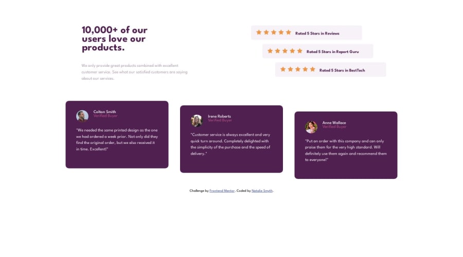
Responsive Social Proof Section using CSS flex-box
Design comparison
Solution retrospective
I have been trying to switch from a desktop first approach to mobile first, but with this project I think it ended up making my code more bloated than it would have been. I know it's reasonable for changing your approach to take some time to get used to, but I've been using mobile-first for a few months now and I haven't struggled this much with any other project I've worked on. My question is this: are there certain aspects of a layout design that I can look for in order to decide whether I should start with mobile or desktop, or is this something that becomes easier with time and practice?
Community feedback
- @0xabdulkhaliqPosted almost 2 years ago
Hello there 👋. Congratulations on successfully completing the challenge! 🎉
- I have other recommendations regarding your code that I believe will be of great interest to you.
CSS 🎨:
- Looks like the component has not been centered properly. So let me explain, How you can easily center the component without using
marginorpadding.
- We don't need to use
marginandpaddingto center the component both horizontally & vertically. Because usingmarginorpaddingwill not dynamical centers our component at all states
- To properly center the component in the page, you should use
FlexboxorGridlayout. You can read more about centering in CSS here 📚.
- For this demonstration we use css
Gridto center the component.
body { min-height: 100vh; display: grid; place-items: center; }- Now remove these styles, after removing you can able to see the changes
.container {     <--- Hereafter avoid duplicating styles rules --->
margin: 2em auto;
}

@media (min-width: 1000px)
.container {
margin: 2em auto;
}
- Now your component has been properly centered
.
I hope you find this helpful 😄 Above all, the solution you submitted is great !
Happy coding!
Marked as helpful0 - P@atif-devPosted almost 2 years ago
Hi, congrats on completing the challenge. Mobile first vs desktop first I also sometimes stumble with this concept. I have heard most people say to pick mobile first but actually, it depends upon the current situations/possibilities we are facing. You can read about the mobile first vs desktop first discussion here
Hope you will find this Feedback Helpful.
Marked as helpful0 - @OmprakashRPosted almost 2 years ago
Hi, Congratulations!
As are you using the flexbox approach, I have some inputs for this
- in the container
.container { text-align: left; margin: 2em auto; }
you add
margin:2em autofor the center container just update it into themargin:0px auto.- use for this also for the mobile view
.lead-textaddmargin:0px auto. Or use can use thisalign-items: center; display: flex; flex-direction: column;.
for center all components in centered for mobile approach.
- use this code for a center entire container in the center's
body{min-height: 100vh; display: flex; justify-content: center; align-items: center; flex-direction: column;}after adding this use need to add some gap space in.reviews { flex-direction: row; margin-top: 3em; gap: 10px;
I hope this is helpful to you.
Thank you!!!!!
Marked as helpful0 - in the container
Please log in to post a comment
Log in with GitHubJoin our Discord community
Join thousands of Frontend Mentor community members taking the challenges, sharing resources, helping each other, and chatting about all things front-end!
Join our Discord
