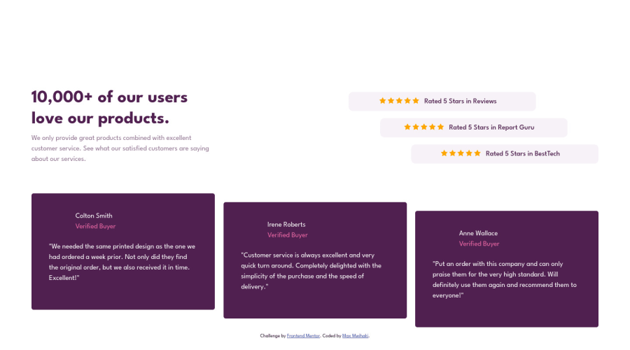
Design comparison
SolutionDesign
Community feedback
- @LeskimPosted about 2 years ago
Hello, Kudos on completing the challenge👏🏾. To get the
column2andcolumn3to look like the design(move a bit from the top) you can use thetransform property--transform: translateY(20px)forcolumn2and about 40px forcolumn3. I can see you tried it withmargin-top.Marked as helpful0
Please log in to post a comment
Log in with GitHubJoin our Discord community
Join thousands of Frontend Mentor community members taking the challenges, sharing resources, helping each other, and chatting about all things front-end!
Join our Discord
