

Design comparison

Community feedback
- @GentlestanPosted 3 months ago
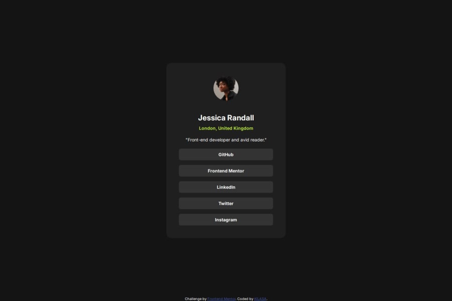
Your final work looks fantastic and is even better than mine! I took a close look at your code, and I appreciate the clear structure you've used. The use of semantic HTML elements like <main> and <footer> really helps with SEO, accessibility, and overall readability, making the content well-organized.
I also noticed that you’ve included an alt attribute for the <img> tag, which is excellent for accessibility.
One improvement I would suggest is regarding the responsiveness: the design includes two breakpoints—one for mobile and one for tablet. However, the tablet breakpoint seems to be missing. It would be great if you could implement that to ensure the design adapts well on tablet-sized screens.
Marked as helpful0

Please log in to post a comment
Log in with GitHubJoin our Discord community
Join thousands of Frontend Mentor community members taking the challenges, sharing resources, helping each other, and chatting about all things front-end!
Join our Discord