Not Found
Not Found
Not Found
Not Found
Not Found
Not Found
Not Found
Not Found
Not Found
Not Found
Not Found
Not Found
Not Found
Not Found
Not Found
Not Found
Not Found
Not Found
Not Found
Not Found

Submitted

Responsive Social Profile Links Page

@TheNewbie-Coder

Desktop design screenshot for the Social links profile coding challenge

This is a solution for...

  • HTML
  • CSS
1newbie
View challenge

Design comparison


SolutionDesign

Solution retrospective


What are you most proud of, and what would you do differently next time?

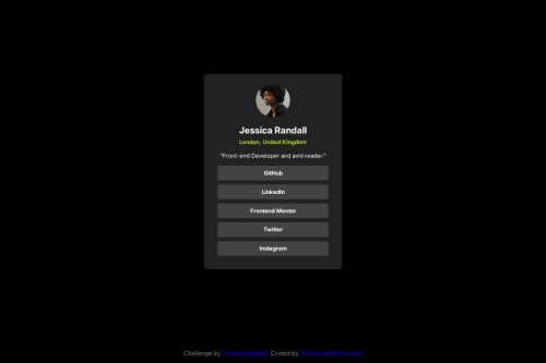
I was able to apply the flexbox layout design and see what difference the design makes when i used a CSS Reset. My landing has more accessibility this time around thanks to the feedback given by our community for my QR Code project - i used rem as a unit of measurement for font-size.

What challenges did you encounter, and how did you overcome them?

my display faced an overflow issue when it came to the mobile view and realized i had to set an initial scale attribute in the meta tag to fix.

i also came across an issue on applying the font sizes i installed based on the design file within my css file. (i tried using var (), but it didn't work - i just put the inter font and bolded it for certain texts).

What specific areas of your project would you like help with?

  1. how do i use the var () in terms of inputting fonts and color schemes in css?

Community feedback

T
Grace 30,650

@grace-snow

Posted

This looks good but I'd like to clear up some possible misunderstandings in html:

  • using a header element in this is exactly the same as using a div. Headers are meaningless inside other landmarks unless labelled. This doesn't need labelling or need to be a header as the heading element already provides all that's required for understanding the page content. Its not a problem using it, but it adds no benefit so I'd remove it.
  • this should only have one heading (the person's name). The location doesn't make sense as a heading for all content under it, so should be a paragraph.
  • height and width attributes in html must not include the unit in their value. E.g. It must be height="100" not height="100px".
  • the reason to use height and width attributes on images sometimes is only to let the browser know what aspect ratio of space they should save for the image while it's loading in. So include both height and width, or just use aspect-ratio: 1 in the css to get the same small performance boost.
  • personally I'd consider the image in this as decorative and give it empty alt. If you think it's important/meaningful content then the image needs to be descriptive, not just repeat the person's name which is repeated in the heading straight after it.
  • try to keep html as simple as possible. This is only one card. You shouldn't need a separate wrapper around the text content and another around the list of links. See what you can remove.
  • when links open in a new tab, this non-standard behaviour causes a "change of context" which needs to be communicated in the code so screen reader users are aware they've left the site "(Opens in a new tab)". Usually this is done with some sr-only text in a span in the link, in sr-only pseudo element content or via the title attribute.
  • note the attribution links currently cause 2 WCAG accessibility failures. First they fail minimum contrast requirements (4.5:1 for normal text). Second they are onky distinguishable as links by colour alone. Because you've removed link underlines on an element selector in css instead of only removing it on a class to target the social links, that could make this failure site-wide on a larger website. Links need to look clickable / be clearly distinguishable from surrounding text.

Marked as helpful

0

Please log in to post a comment

Log in with GitHub
Discord logo

Join our Discord community

Join thousands of Frontend Mentor community members taking the challenges, sharing resources, helping each other, and chatting about all things front-end!

Join our Discord