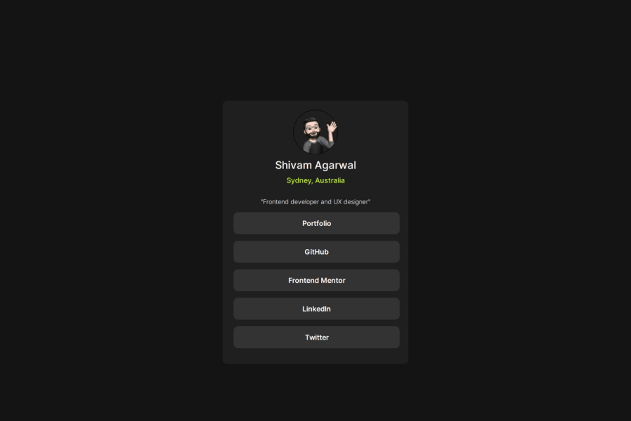
Design comparison
Solution retrospective
It's quite close to the original, so that's what I'm proud of.
What challenges did you encounter, and how did you overcome them?I did not know about the hover state property. So I had to take help from ChatGPT to learn and implement it into my code.
What specific areas of your project would you like help with?How could I use Flexbox more in my code or other related responsive elements?
Also, I would love some feedback on how I might be able to use more relative measuring units like em and rem in my code efficiently.
Community feedback
- @kodan96Posted 7 months ago
hi there! ๐๐
You should avoid hard-coded values (pixels) most of the time. When you use these values you give up responsiveness(or you make it harder for yourself at least)..
Typically you will increase the
font-size
property with@media
queries. If you have hard-coded values all over your CSS, you need to modify every element'sfont-size
. On the other hand, if you userem
-s all you need to do is changing thefont-size
in your CSS:root
selector and all your elements will have a new size based on that value.I usually use
em
forpadding
andmargin
for text-based elements, since their margin usually based on theirfont-size
, and again, when you change thefont-size
in:root
these values will scale up as well without you touching them, making your job easier and your page maintainable.If you are not familiar with the
:root
selector it's usually used to set custom properties that you can apply later.Hope this helped ๐
Good luck and happy coding! ๐ช
0@undrthegraveyardPosted 7 months ago@kodan96 really appreciate your response and feedback. Quite helpful, indeed. I will for sure be more mindful in my future projects about this.
Thank you so much!
1
Please log in to post a comment
Log in with GitHubJoin our Discord community
Join thousands of Frontend Mentor community members taking the challenges, sharing resources, helping each other, and chatting about all things front-end!
Join our Discord