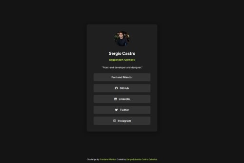
Responsive Social Media-Sharing Component with Scss

Solution retrospective
Without proper design guides (Figma file in this case), I tend to add to many arbitrary values for spacing, font sizes etc. So for this challenge I did my best to keep them as simple and reusable as possible.
What challenges did you encounter, and how did you overcome them?Since I try to always center the components in the screen, I use either flexbox or grid, and I tend to forget that when doing that sometimes the children components do not have a width of 100% by default, so I took me a good 3 minutes trying to figure out why my component was not expanding.
What specific areas of your project would you like help with?Nothing in specific but any feedback is appreciated.
Please log in to post a comment
Log in with GitHubCommunity feedback
No feedback yet. Be the first to give feedback on Sergio Eduardo Castro Ceballos's solution.
Join our Discord community
Join thousands of Frontend Mentor community members taking the challenges, sharing resources, helping each other, and chatting about all things front-end!
Join our Discord