Design comparison
Solution retrospective
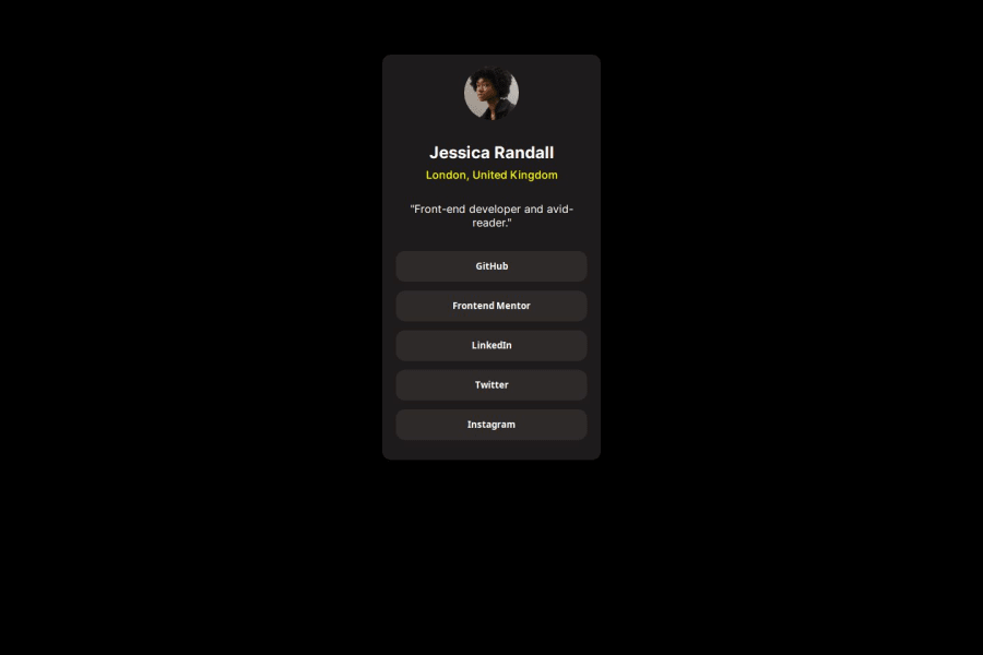
Again some issues with the responsive design, I used max-width and max-height for the container inside the body, but I don't know if thats the best way to solve it.
Community feedback
- @Smart-Ace-DesignsPosted 9 months ago
This looks really good - excellent job! A few suggestions I can provide: update the responsive design for small screen sizes so that the avatar is hidden by using a media query (or breakpoint if using Tailwind); you also might want to make the width a bit wider so that the quoted text fits on one line.
Marked as helpful0 - @Smart-Ace-DesignsPosted 9 months ago
I incorrectly mentioned that the avatar should be hidden in mobile mode - I rechecked the design image and it is not hidden. Sorry about that - disregard my previous comment. I must have been thinking of a different design problem. :)
1
Please log in to post a comment
Log in with GitHubJoin our Discord community
Join thousands of Frontend Mentor community members taking the challenges, sharing resources, helping each other, and chatting about all things front-end!
Join our Discord
