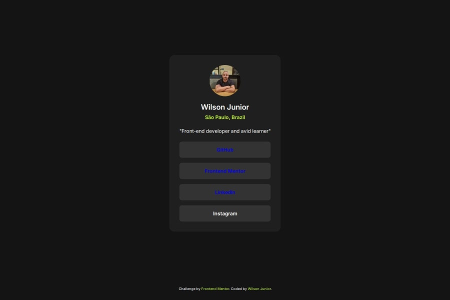


Design comparison

Solution retrospective
I am most proud of the clean and responsive design I was able to achieve with just HTML and CSS. The use of Flexbox allowed me to create a layout that adapts well to different screen sizes, ensuring that the profile page looks good on both desktop and mobile devices. Additionally, I’m pleased with the use of CSS transitions to add subtle hover effects, enhancing the user experience.
What challenges did you encounter, and how did you overcome them?One of the main challenges I encountered was ensuring the layout remained responsive across different screen sizes. Initially, the sections and elements didn't align properly on smaller screens, causing the design to break. I overcame this by leveraging CSS Flexbox to create a flexible and adaptable layout. By experimenting with various Flexbox properties and adjusting padding, margins, and widths, I managed to create a layout that adjusts seamlessly to different devices.
Community feedback
Please log in to post a comment
Log in with GitHub
Join our Discord community
Join thousands of Frontend Mentor community members taking the challenges, sharing resources, helping each other, and chatting about all things front-end!
Join our Discord