Responsive Social Media landing page using TailwindCSS


Design comparison

Solution retrospective
I'm most proud of completing the project because, without the figma files giving the specific measurements, I had to eyeball the length and width of the card and buttons so that took me quite a while to figure out. What I would do differently, is make sure that I have the pro version of frontend mentor so that I can have a bit of more professional workflow.
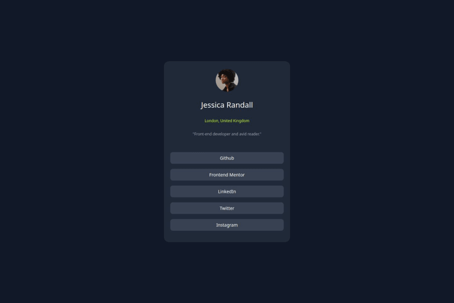
What challenges did you encounter, and how did you overcome them?I don't know if it was my eyes, but I couldn't figure out how to get the "London, united kingdom" part directly underneath the title, so I took off the top and bottom margins hoping that it did something. Also, the colors that were given in the styles guide at leas to me looked off from the finished image that was provided but I still went with it.
What specific areas of your project would you like help with?I mentioned earlier that I wasn't able to get the "London, United Kingdom" part directly underneath the title so I was wondering what should I do differently there, other than that; I think I did ok with the project.
Community feedback
- @ChrisRolandPosted 6 months ago
Nice work!
To solve the issue you mentioned. It should be pretty easy since you're using Tailwind, you could simply add
text-centerto the wrapping container or directly to theh2element containing the text.Marked as helpful1

Please log in to post a comment
Log in with GitHubJoin our Discord community
Join thousands of Frontend Mentor community members taking the challenges, sharing resources, helping each other, and chatting about all things front-end!
Join our Discord