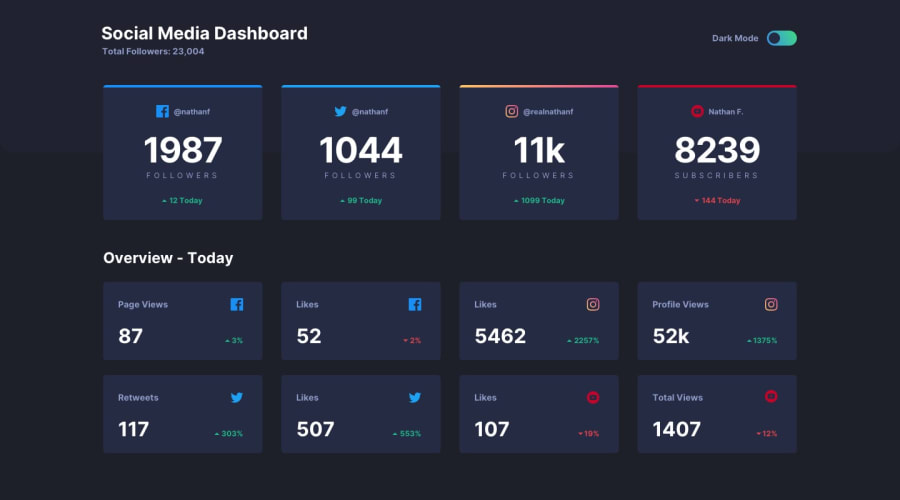
Responsive social media dashboard with theme switcher
Design comparison
Solution retrospective
I would be happy to hear all of your feedback and advices.
Community feedback
- @Comet466Posted over 3 years ago
hi Yesser crazy to think i just finished this challenge too, your solution looks great congratulations, good use of relative units and flexbox model, only a minor details to point out, the dashboard-header is always in the mobile version of the intended design, other than that pretty solid work Yesser, nice
Marked as helpful0@yasertarekPosted over 3 years ago@Comet466 can you explain more, please? I didn't understand and thanks for your interest!♥
0 - @palgrammingPosted over 3 years ago
well you should work on the hover states for the slider button. You can look at my solution if you can to see what I am talking about
Marked as helpful0@yasertarekPosted over 3 years ago@palgramming I didn't really notice it, Thanks for your great feedback!
0
Please log in to post a comment
Log in with GitHubJoin our Discord community
Join thousands of Frontend Mentor community members taking the challenges, sharing resources, helping each other, and chatting about all things front-end!
Join our Discord
