Submitted about 2 years ago
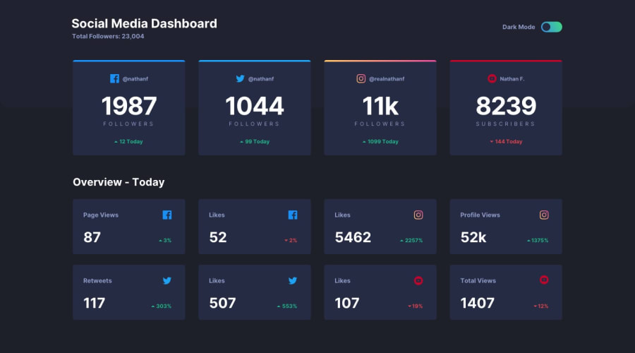
Responsive Social Media Dashboard with Theme Switcher
@VishwajeetBarve
Design comparison
SolutionDesign
Solution retrospective
This is my solution to the Social Media Dashboard. Made use of Grid, Flex, etc
Any suggestions or tweaks are appreciated.✌
Community feedback
- @Yemisrach15Posted about 2 years ago
Hi Vishwajeet, your solution is responsive, great job! Here are some improvements I suggest,
- The divs with class
mainandheadercan actually be replaced with their respective tags,<main></main>and<header></header>. - Headers should be hierarchical meaning you shouldn't skip h2 and use h4. They should go in order.
- Only one
h1heading per document to indicate what the main page title is. - Provide descriptive alt text for images. This helps screen reader users visualize(?) the image and in case the image is not loaded the alt text is shown. This is for the social media icons in this case. For purely decorative images leave the alt empty.
- Never use px for font-size. Use em/rem so that it scales when zooming in the browser or if browser font preference is changed in settings.
Keep coding!
0 - The divs with class
Please log in to post a comment
Log in with GitHubJoin our Discord community
Join thousands of Frontend Mentor community members taking the challenges, sharing resources, helping each other, and chatting about all things front-end!
Join our Discord
