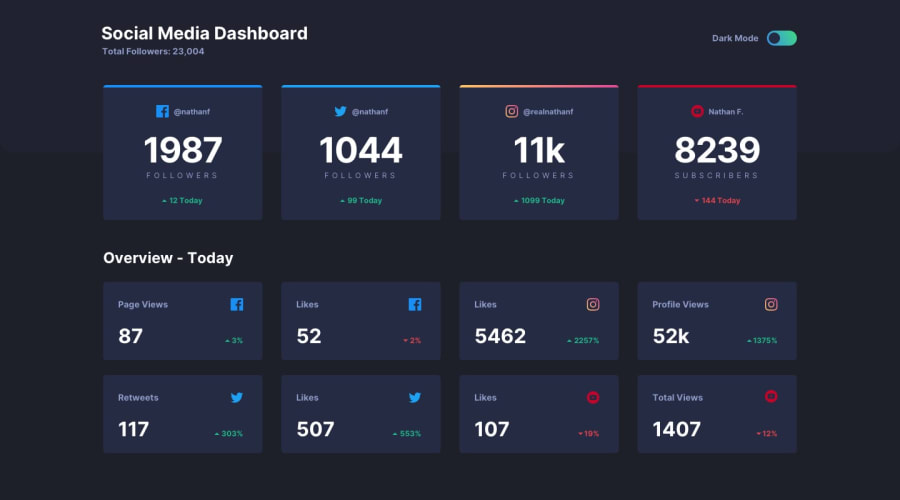
responsive social media dashboard with SCSS and BEM Notation
Design comparison
Solution retrospective
I learned a lot about the prefers color scheme feature of the browsers. I didn't have to add it but I wanted to use this project to practice it. This was also the first time I used scss so it was nice to get some practice in with it. The theme switching checks was also fun to work on. I also practice new ways of naming for styling and scripting, i.e using classes and data-attributes respectively. I am trying to develop a working process that I can follow for future projects. I have gotten better at building toggle buttons and manipulation them too and, the scss really made styling everything a little bit more organized. In the JS file, there may be some repeated code, but that is the only way I currently know how to make a theme switcher.
What specific areas of your project would you like help with?I would like advice on organizing scss code and what are the best situations to use it in as I just used it to write the entire CSS file, but I don't know if there are better use cases for it.
Please log in to post a comment
Log in with GitHubCommunity feedback
No feedback yet. Be the first to give feedback on Edidiong's solution.
Join our Discord community
Join thousands of Frontend Mentor community members taking the challenges, sharing resources, helping each other, and chatting about all things front-end!
Join our Discord
