Submitted about 2 years ago
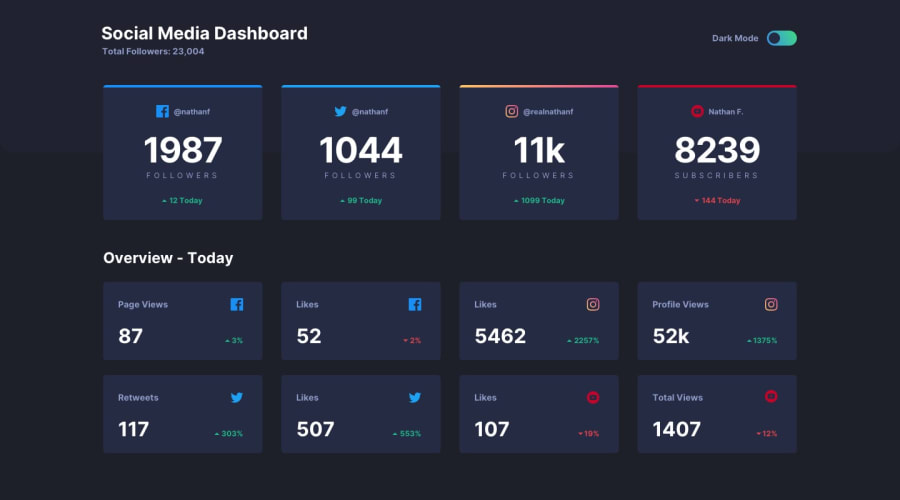
Responsive Social Media Dashboard with dark/light color scheme
@NadiaFrShLm
Design comparison
SolutionDesign
Solution retrospective
That was challenging for me.
Still not sure is it useful to split all the components to several files (typography, layout, breakpoints, variables...)
Sure the JS code could be more compact, but for now I'm proud of my result.
Community feedback
- @Yemisrach15Posted about 2 years ago
Hey Nadia, hooray for the zero report! The sass architecture is useful as they say. I think it's more maintainable if you have a separate file for each component. I'm also trying to use 7-1 pattern. Here are a couple of suggestions I can give you,
- Put the
navelement outsidemainand inside aheaderelement. - I wouldn't use
articlefor the element with class.card.articles should have self-contained information but here the information is too large, in my opinion. For the blocks/boxes though it might be appropriate.
1 - Put the
Please log in to post a comment
Log in with GitHubJoin our Discord community
Join thousands of Frontend Mentor community members taking the challenges, sharing resources, helping each other, and chatting about all things front-end!
Join our Discord
