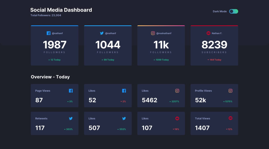
Responsive Social media dashboard with custom theme switcher
Design comparison
Solution retrospective
I took the opportunity in this project to implement a toggle switch from scratch. Most tutorials would suggest to implement that as a checkbox with the appropriate associated styling. However, I made up my mind to go another way and to place two div elements, one inside the other. It took me a while to do some calculations about the padding and the width and height of div elements to make it look like a real toggle switch. I am still uncertain what would be the pros and cons of using/not using, an input element to implement the toggle switch. I also took the opportunity to implement a Theme provider using the context api. I have to say that I made it through eventually. In the end, it is needless to say that your feedback is highly.
Community feedback
Please log in to post a comment
Log in with GitHubJoin our Discord community
Join thousands of Frontend Mentor community members taking the challenges, sharing resources, helping each other, and chatting about all things front-end!
Join our Discord
