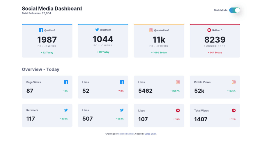
Responsive Social Media Dashboard w/ Dark Mode Toggle
Design comparison
Solution retrospective
Please let me know if there are any errors or different/better ways to create this project. Any feedback is much appreciated... Thanks!
Please log in to post a comment
Log in with GitHubCommunity feedback
- @gmcodes20
Hello, nice code. But one thing I'll point out is the use of semantic HTML, maybe you should check and restructure the semantic for example, header is not supposed to be inside main
Check the out. https://www.google.com/url?sa=t&source=web&rct=j&url=https://www.w3schools.com/html/html5_semantic_elements.asp&ved=2ahUKEwjX2ruOpbj0AhWnILkGHWYpBPwQFnoECAQQAQ&sqi=2&usg=AOvVaw38SC2etR0JeORCKyF1fqbU
Marked as helpful
Join our Discord community
Join thousands of Frontend Mentor community members taking the challenges, sharing resources, helping each other, and chatting about all things front-end!
Join our Discord
