Submitted 4 months ago
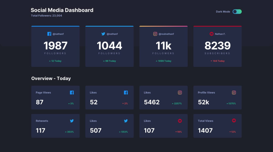
Responsive Social Media Dashboard built with JS
@Sylvester009
Design comparison
SolutionDesign
Solution retrospective
What are you most proud of, and what would you do differently next time?
I am quite proud of the fact that it took me a day only to write this code even though the css is a bit messy.
What challenges did you encounter, and how did you overcome them?when it came to the dark mode aspect, my brain was telling me easy peacy but my hand was like what do you want to do.. But i was able to search online and get the way to write the js code for the toggle.
What specific areas of your project would you like help with?None really, I get that border-color does not accept linear-gradient so i have to wrap the card in a div with a linear background but any help with making my css a little bit clean will be very much appreciated.
Community feedback
Please log in to post a comment
Log in with GitHubJoin our Discord community
Join thousands of Frontend Mentor community members taking the challenges, sharing resources, helping each other, and chatting about all things front-end!
Join our Discord
