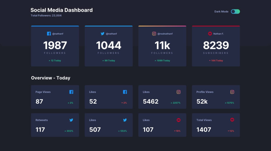
Design comparison
Solution retrospective
I am happy with this solution.
I would appreciate any feedback on where I can improve.
Community feedback
- @Remy349Posted almost 2 years ago
Excellent work, just a few tips for you to improve:
- This one is for the colored line that is at the top of the card, note that you used a <div> to achieve this result and that's fine but I want to introduce you to one that I know, you can add a "position: relative" to the <article> tag that you used to made the card and then this to get the same result:
.article::after {
  content: '';
  position: absolute;
  top: 0;
  width: 100%;
  height: whatever you want, I used 5px;
  background: color here;
}
this will give you the same result try it or keep it in mind for future projects :)
2.The social network icons do not appear, instead only the colors appear but not the icon, you can fix this by using "color: icon color;" this to the <i> tag you used to put the icons.
3.Note that you used sass for the styles, try using @forward instead of @import to import your scss files, I recommend you to read a bit more about it.
I hope you find my advice helpful and keep on with your web development :)
Marked as helpful0@itsmusaPosted almost 2 years ago@Remy349 Thank you for your feedback.
I was not aware of @forward I will definitely look it up.
✌️
0
Please log in to post a comment
Log in with GitHubJoin our Discord community
Join thousands of Frontend Mentor community members taking the challenges, sharing resources, helping each other, and chatting about all things front-end!
Join our Discord
