Design comparison
SolutionDesign
Solution retrospective
What are you most proud of, and what would you do differently next time?
I'm most proud of figuring out branching and pushing using git. I was always able to create a branch, but wasn't pushing to remote branch.
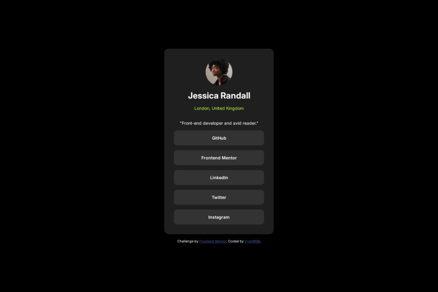
What challenges did you encounter, and how did you overcome them?The largest challenges are not being too sure about the typography even though the style guide is included. Nailing the font size and weights is difficult without the Figma file. I can get close without it though. I also tend to use rem for gaps and padding, so that is also not exact.
What specific areas of your project would you like help with?Figuring out the correct spacing, font sizes/weights, etc. without using the Figma file.
Community feedback
Please log in to post a comment
Log in with GitHubJoin our Discord community
Join thousands of Frontend Mentor community members taking the challenges, sharing resources, helping each other, and chatting about all things front-end!
Join our Discord
