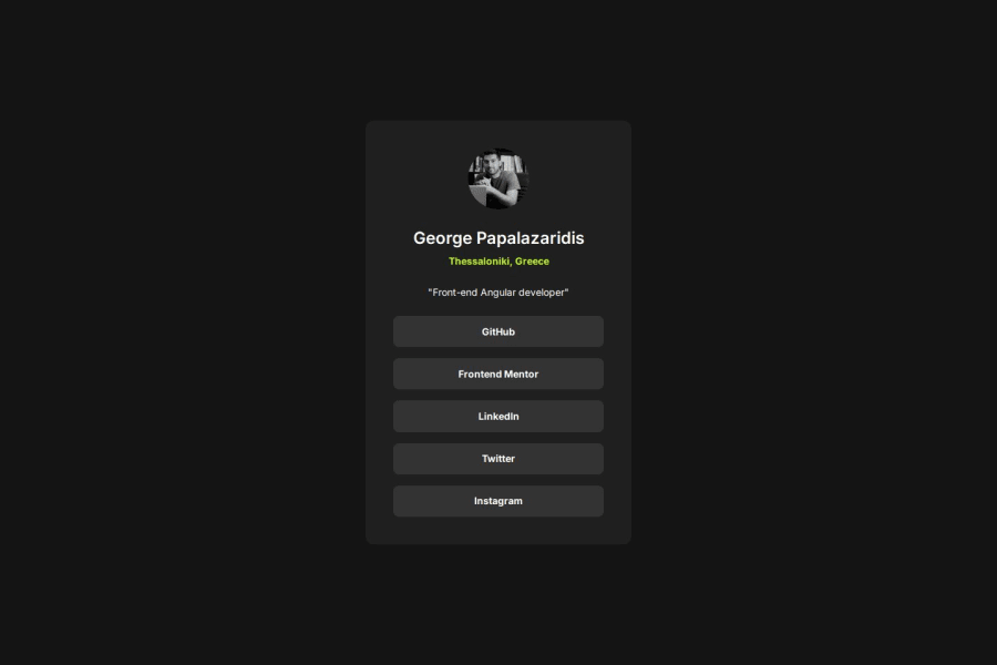
Responsive Social Links Profile with Semantic HTML, SCSS, and Dynamic


Design comparison

Solution retrospective
I am most proud of successfully implementing dynamic JavaScript components to create reusable and maintainable code, as well as using SCSS for modular and scalable styling. Additionally, implementing a dynamic base URL solution ensured smooth deployment and functionality across both local and production environments. These features made the project more flexible, dynamic, and user-friendly.
Next time, I would explore adding animations and micro-interactions to enhance the user experience further. I would also consider experimenting with CSS Grid in conjunction with Flexbox to optimize the layout and structure of the project.
What challenges did you encounter, and how did you overcome them?-
Dynamic
baseURL for Local and Production Environments:
Managing the dynamicbaseURL for local development and production on GitHub Pages was one of the most significant challenges. Initially, this caused issues with assets and scripts not loading properly in the deployed environment. The problem was resolved by implementing a JavaScript script to set thebaseURL dynamically based on the environment (window.location.hostname). -
Ensuring Accessibility Compliance:
Guaranteeing proper accessibility for buttons and links required careful implementation ofaria-labelsand semantic tags. This was particularly challenging because it involved considering the needs of screen readers and keyboard navigation users. Testing the project with accessibility tools helped refine these aspects. -
SCSS Refactoring and Modularity:
Organizing the SCSS styles into modular files while ensuring consistency across components was another challenge. Ensuring that variables, mixins, and nesting were applied efficiently required thoughtful structuring of the SCSS files. -
Reusable JavaScript Components:
Refactoring the buttons into a reusable component using JavaScript posed a challenge in terms of balancing dynamic functionality with semantic HTML structure. Iterative testing and debugging ensured the component's robustness and adaptability. -
Responsive Design for Multiple Breakpoints:
Adapting the layout to mobile, tablet, and desktop screens while maintaining design consistency was an iterative process. The combination of media queries and dynamic SCSS variables proved effective but required meticulous testing across multiple screen sizes. -
Debugging Hover and Focus State Issues:
Achieving consistent hover, focus, and active states for the buttons was initially tricky, as certain styles did not apply correctly due to specificity and cascade issues. Revisiting the CSS selectors and leveraging SCSS nesting helped resolve these problems.
By tackling these challenges, I gained valuable experience in debugging, accessibility, modular styling, and ensuring cross-environment compatibility.
What specific areas of your project would you like help with?- Accessibility Enhancements: Are there additional best practices or tools I could use to ensure the project is fully accessible, especially for users relying on screen readers or keyboard navigation?
- SCSS Organization and Scalability: While the SCSS code is modular, I would appreciate suggestions on further optimizing its structure and improving scalability for larger projects. Are there any specific methodologies (e.g., BEM, ITCSS) that might be useful here?
- Reusable JavaScript Components: Feedback on the structure and maintainability of the dynamic button component would be highly valuable. Are there any techniques or patterns that would make the component more robust and scalable for future extensions?
Community feedback
- P@yudin7324Posted about 2 months ago
not pixel perfect =), but good implementation and functionality
0

Please log in to post a comment
Log in with GitHub
Join our Discord community
Join thousands of Frontend Mentor community members taking the challenges, sharing resources, helping each other, and chatting about all things front-end!
Join our Discord