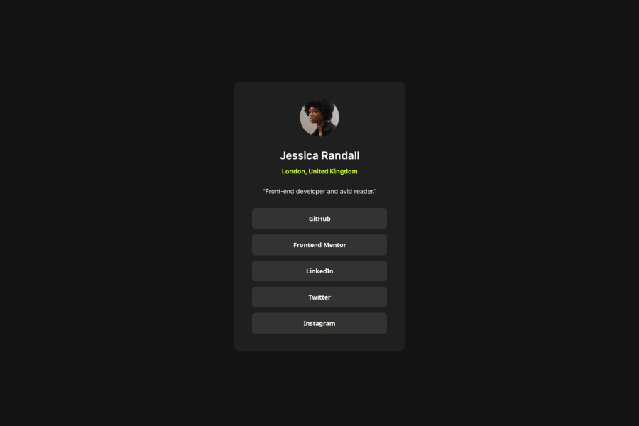
Responsive Social Links Profile with HTML/CSS :) (Second attempt)


Design comparison

Solution retrospective
I'm getting better utilizing Flex and it's making everything much, much faster. Also helps with getting the responsive designs to work correctly.
What challenges did you encounter, and how did you overcome them?I have problems with nesting divs and using flex box. Sometimes I want to do things, but nothing happens. I overcome this challenge by watching what happens in the live server anytime I try something new.
What specific areas of your project would you like help with?Is my code easy to read? How can I make it easier to understand?
Community feedback
- @FraCav99Posted about 1 year ago
Hi Yas, good job on this one.
I have some hints for you to better improve the code.
The first important thing is to set a reset in your CSS code. This guarantee a equal starting point for all browser removing any inconsistency.
Two good resets I've found on the web are these two:
You don't have to use all the rules used in them, but you can tweak one the two resets based on your needs. For example, in this project this is what I used:
*,
*::before,
*::after {
  margin: 0;
  box-sizing: border-box;
}

body {
  ...other code
  min-height: 100vh;
  min-height: 100dvh;
  ...other code
}

img {
  display: block;
  max-width: 100%;
}
Is my code easy to read? How can I make it easier to understand?
Comes to formatting, you can install a vs code extension called Prettier, which is good for formatting the code in an easy readable way.
Beside that, I found it a little bit repetitive, since you use a lots of time flexbox where it's not really needed and add only more code.
Flexbox is a good way to lay out content, but you can embrace the natural behaviour of CSS. For example, all block elements (i.e.
p, div, h1, h2, etc..) naturally stack on top of each other, since they take all the space available by default.Also what you can do is to flatten you HTML code and this helps you makes things a lot easier in CSS. For example:
Instead of what you've done:
 <main class="main-container">
    <div class="user-info-container">
      <img class="user-photo" src="assets/images/avatar-jessica.jpeg" alt="profile-picture">
        <div class="info-2">
          <p class="user-name">Jessica Randall</p>
          <p class="user-location">London, United Kingdom</p>
        </div>
        <p class="user-description">"Front-end developer and avid reader."</p>
      </div>

     ...rest of code
  </main>
I'd done something like:
 <main class="main-container">
 <img class="user-photo" src="assets/images/avatar-jessica.jpeg" alt="profile-picture">
          <p class="user-name">Jessica Randall</p>
          <p class="user-location">London, United Kingdom</p>

     ...rest of code
  </main>
Doing that you have a flat structure in your HTML and in your CSS you can just put the flexbox on your main! :)
Another thing I recommend you to do is, avoid using
pxunits formargin,paddingandfont-size. Rather use units likerem,emorch(forfont-sizeavoidem, since this unit cause unexpected effects if not using with attention)This because if user takes time to change font-size from browser settings, if you use px units, they basically ignore the font set by the user.
Last things is an accessibility topic. Don't overuse
divelements, since it doesn't have any semantic meaning to screen readers. Use them as generic containers when you don't have any better alternatives to group content.One thing I'd change is the list of social links. Instead of using buttons, like you did, I'd use an unorder list element of links, since they are effectively links.
So instead of:
 <div class="social-buttons">
  <button>GitHub</button>
  <button>Frontend Mentor</button>
  <button>LinkedIn</button>
  <button>Twitter</button>
  <button>Instagram</button>
  </div>
this:
      <ul class="social-links">
        <li><a href="#">Github</a></li>
        <li><a href="#">Frontend Mentor</a></li>
        <li><a href="#">LinkedIn</a></li>
        <li><a href="#">Twitter</a></li>
        <li><a href="#">Instagram</a></li>
      </ul>
This because, as I said, they're links, not actions. But this is just my opinion, maybe someone could disagree with that.
I hope you find this hints useful.
Other than that, you did an amazing job! :)
Consider also diving in CSS Grid, they're very good to organize your layout in an easy way!
Keep coding! :)
0@yas-avocadPosted about 1 year ago@FraCav99 Hey! Thanks for your feedback.
One question, so the
<div class=main-container>is just to target the padding and styles of the entire card. Then, the<div class= user-info-container>adds a flex and spacing to the 'top container' which has the profile image, user name, and user bio. There is another<div>for the 'bottom container' which has the buttons/links. The spacing is different for the buttons, so it has it's own flex box.So if I flatten my code, would I add the flex that targets the 'top container' to the
<div class=main-container>? Wouldn't that affect the 'bottom container' with the buttons?0@FraCav99Posted about 1 year ago@yas-avocad
Well you can just don't use flexbox at all in this specific case, but if you want to use it anyway, you can put the padding the
main-containeras you said and a flexbox of:.main-container { display: flex; flex-direction: column; align-items: center; gap: /* your gap */ padding: /* your padding */ }and your HTML something like:
<div class="main-container">
  <img src="..." alt="..." />
  <h2>...</h2>
  <p class="location">...</p>
  <p class="description">...</p>

   <ul class="social-links">
     <li><a href="#">...</a></li>
     the rest of the links...
   </ul>
</div>
gap here will be applied to all elements, but not on the
<li>elements, since they're inside the<ul>element.To solve this you can give a
margin-topto every<li>element like this:.social-links li + li { margin-top: 1em; /* for example */ }with this combinator we're saying that every next
<li>sibling (the next to each other, so to say), has the margin-top you specifiy but not the first (for more info check this MDN article).Last thing to make your links clickable if you hover far from the text of the link is to make them
display: block, so they automatically fill the entire space of the<li>and then apply all the styles on theaelement. So this will be:.social-links > li + li { margin-top: 1em; /* change as you please */ } .social-link > li > a { display: block; ...rest of ruleset } .social-link > li > a:hover { ...rulest applied when hover }Hope this helps. If something's not clear, just don't hesitate to ask! :)
0

Please log in to post a comment
Log in with GitHub
Join our Discord community
Join thousands of Frontend Mentor community members taking the challenges, sharing resources, helping each other, and chatting about all things front-end!
Join our Discord