Responsive Social Links Profile using Tailwind CSS


Design comparison

Solution retrospective
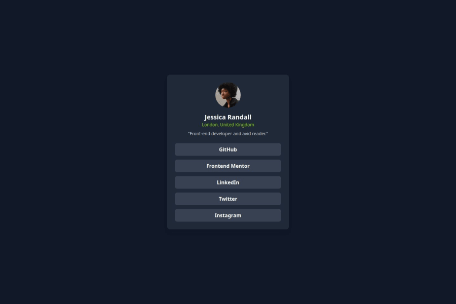
I’m most proud of how well the responsive design turned out using Tailwind CSS. The layout adapts smoothly across different screen sizes, and the hover/focus states enhance the interactivity.
Next time, I would focus more on optimizing accessibility by improving keyboard navigation and testing with screen readers. I would also explore adding animations or subtle transitions to make the UI more engaging.
What challenges did you encounter, and how did you overcome them?One challenge I faced was centering the profile card properly while ensuring it remained responsive across different screen sizes. Initially, using fixed positioning caused layout issues, but I resolved it by using Flexbox and Tailwind’s flex, justify-center, and items-center utilities to keep the content aligned dynamically.
Another challenge was customizing hover and focus states for better interactivity. Tailwind’s default styles worked well, but I fine-tuned them using hover:bg-lime-500 and focus:ring to improve the visual feedback for users.
What specific areas of your project would you like help with?Are there better ways to organize Tailwind classes for maintainability and scalability? Would using @apply in a separate CSS file improve readability?
Community feedback
Please log in to post a comment
Log in with GitHubJoin our Discord community
Join thousands of Frontend Mentor community members taking the challenges, sharing resources, helping each other, and chatting about all things front-end!
Join our Discord