Design comparison
SolutionDesign
Community feedback
- @StroudyPosted about 1 month ago
Amazing job with this! You’re making fantastic progress. Here are some small tweaks that might take your solution to the next level…
- Center your body with this code snippet,
min-height: 100svh; display: flex; justify-content: center; flex-direction: column; align-items: center;- I would put these into a
<ul> <li>, and the text should be wrapped with a<a>so it is accessible with a keyboard using the tab key, Using an<a>tag for navigation is semantically correct, improves accessibility for screen readers, and ensures consistent behavior across browsers, unlike a<button>or a<div>not intended for links.
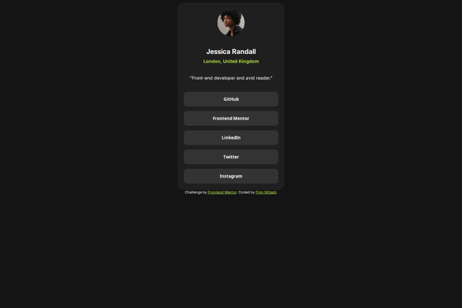
<div class="button-list"> <button>GitHub</button> <button>Frontend Mentor</button> <button>LinkedIn</button> <button>Twitter</button> <button>Instagram</button> </div>- For future project, You could download and host your own fonts using
@font-faceimproves website performance by reducing external requests, provides more control over font usage, ensures consistency across browsers, enhances offline availability, and avoids potential issues if third-party font services become unavailable. Place to get .woff2 fonts
You’re doing fantastic! I hope these tips help you as you continue your coding journey. Stay curious and keep experimenting—every challenge is an opportunity to learn. Have fun, and keep coding with confidence! 🌟
0
Please log in to post a comment
Log in with GitHubJoin our Discord community
Join thousands of Frontend Mentor community members taking the challenges, sharing resources, helping each other, and chatting about all things front-end!
Join our Discord

