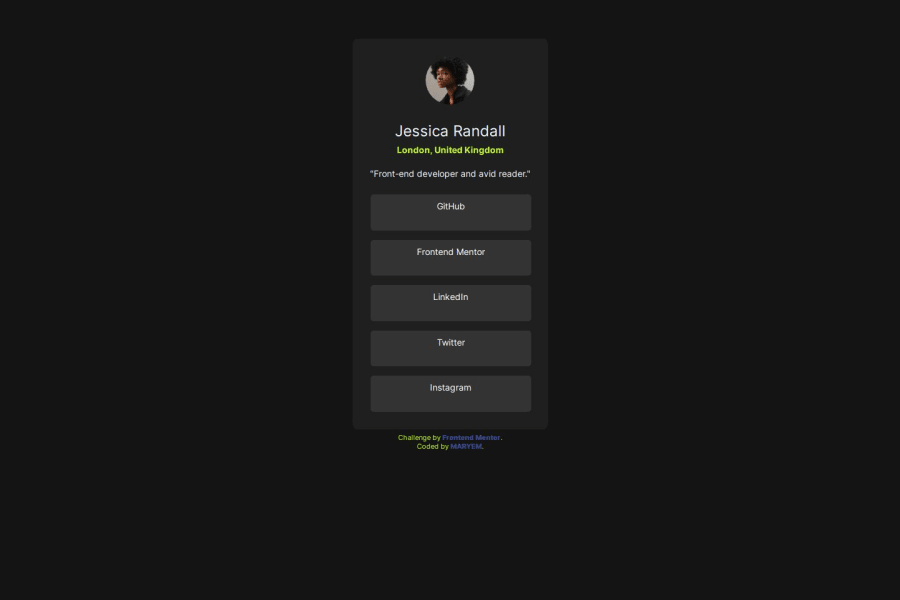
Design comparison
Solution retrospective
Hi,All feedback is welcome. Thank you in advance.
Community feedback
- @IzykGitPosted 9 months ago
Looks good but something you should consider is to not use the <div> tag inside of the anchor tag. While is is technically correct, from what I have read and heard it is not good practice and should be avoided in this case.
It is also bad practice to put text directly inside of a div tag without any other elements as it gives no context for what the text is. Instead it would of been better to use the text inside of the anchor tag.
Here is more resources
Marked as helpful1 - @osmanbay90Posted 9 months ago
Great job on completing the Frontend Mentor challenge!
your project looks good.
here is a small improvement you should make
Setting min-height: Utilizing
min-height: 100vhon the body ensures that the flexbox layout can utilize the full viewport height, enabling effective vertical centering of elements within the body container.Using Flexbox Properly: Ensure proper utilization of Flexbox. For instance, within your
<main> tag, the declarationjustify-content: space-evenlymay not be necessary as Flexbox isn't explicitly used for the layout there.Working with <div> elements: Integrating
<div>elements within the<main>container can enhance the structure and organization of your HTML, thereby facilitating improved readability, maintainability, and semantic clarity.Remember, practice makes perfect! Keep refining your skills by tackling more challenges on Frontend Mentor. Happy coding! 🚀
Marked as helpful1
Please log in to post a comment
Log in with GitHubJoin our Discord community
Join thousands of Frontend Mentor community members taking the challenges, sharing resources, helping each other, and chatting about all things front-end!
Join our Discord
